Workflow 01
Initiating a new experiment
Forking from a stable checkpoint.
Neptune's Charts, Reports and Dashboards exposed the same experiment data through overlapping concepts. With direct user access restricted, I used existing research, AI synthesis and Customer Success to understand how ML engineers worked. I turned that understanding into a workflow-based workspace vision and a first release that simplified the existing product.
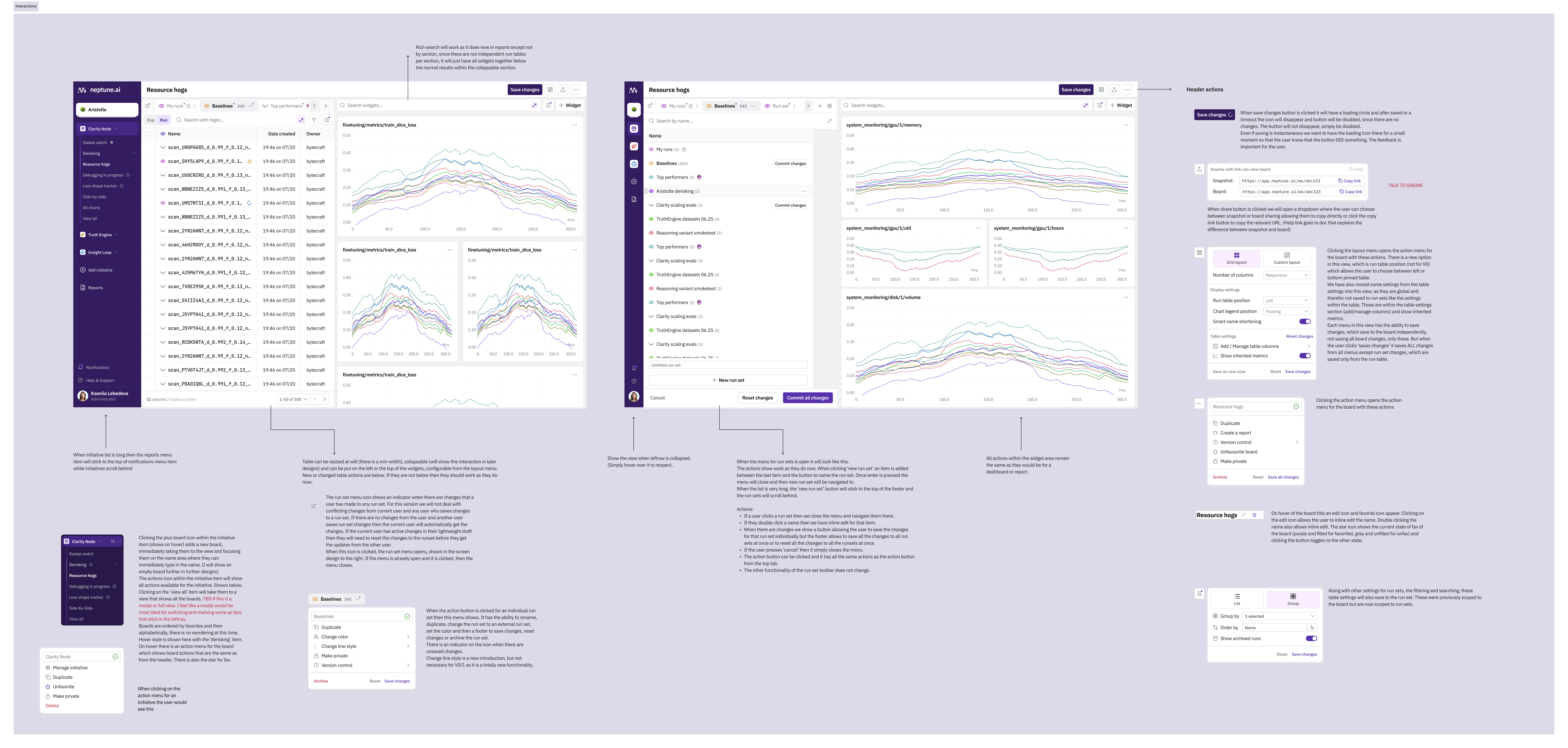
I designed a workspace around the stages of an ML experiment, with run selection, charts and context together. We tested the direction in a prototype and shipped the first part of the redesign. The wider vision remained ahead of that release.
Preparing the view took about two minutes in the prototype, compared with ten in the original workflow. The comparison covered chart selection, metrics and settings before analysis.
Run Sets became generally available. We moved key reporting capabilities into Dashboards and introduced Snapshot, simplifying the overlap between Reports and Dashboards.
The prototype made the wider direction testable: a canvas with starting views for different workflows. Workflow presets and the adaptive layout remained planned work.
I drove the design from domain discovery to the workspace vision, detailed specifications and the first release. Neptune supports ML engineers analysing large numbers of experiments, with data needs that change as their work progresses.
The work took four months, with the Head of Design, product leadership, the frontend team and Customer Success. I used the existing platform as the starting point and mapped what the new experience could reuse.
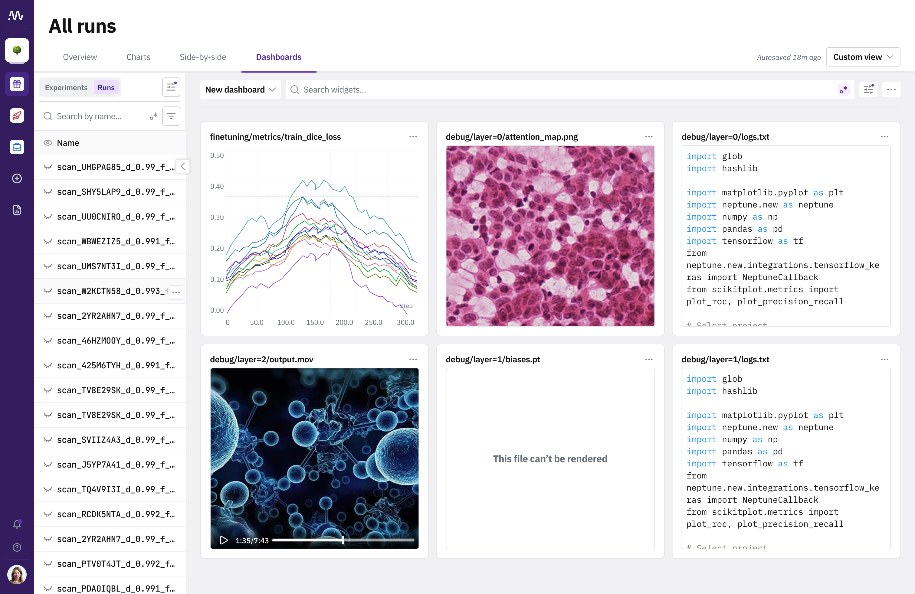

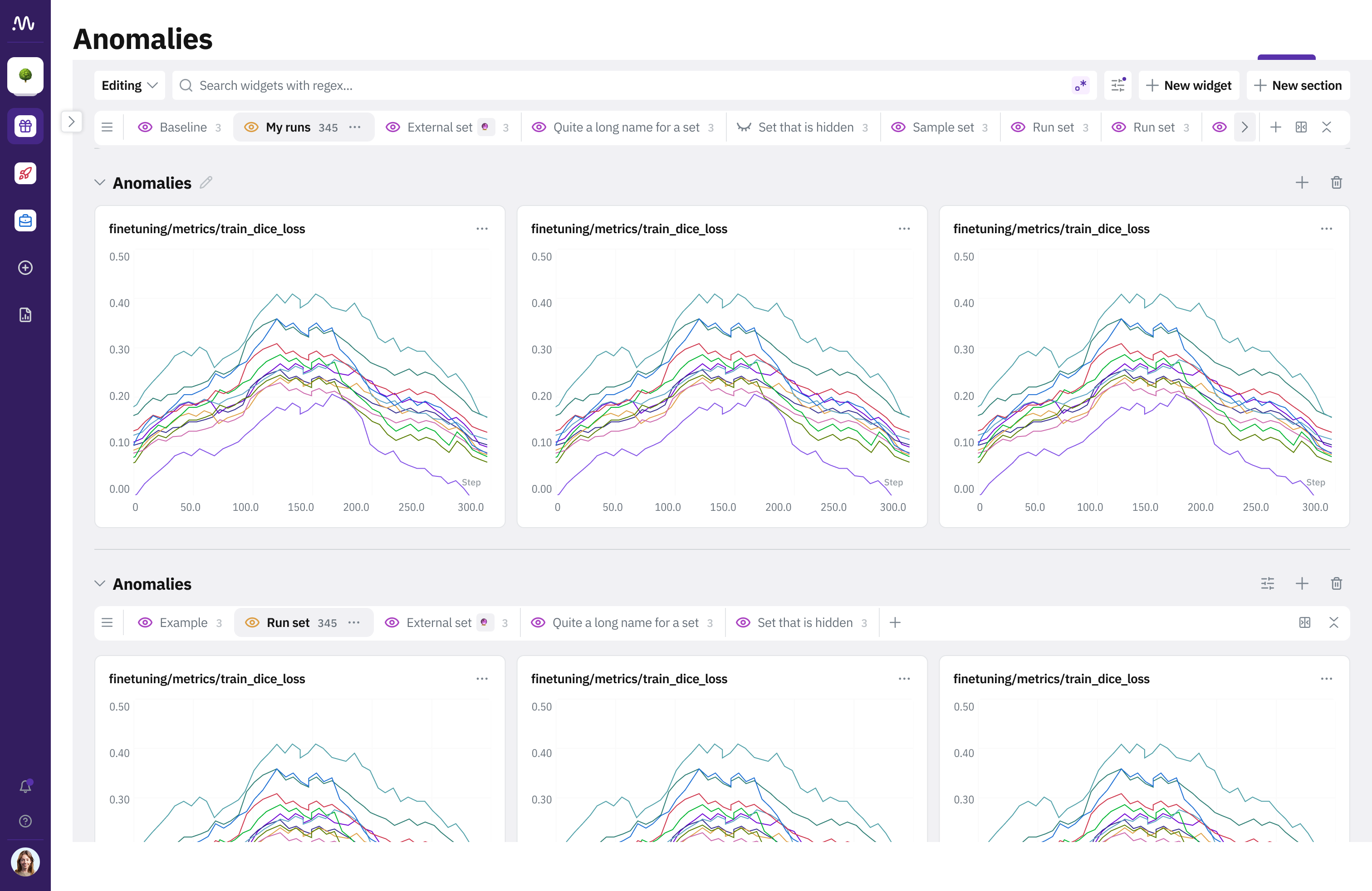
Neptune organised navigation around its system objects. A researcher trying to monitor a run or compare results first had to understand where that work belonged. The navigation made the product's structure the user's problem.
Charts, Reports and Dashboards displayed similar data, with different rules for editing and sharing. Existing research and Customer Success described the confusion. A shared link could also give a colleague a different view of the runs and settings.
Setting up a view with six charts took roughly 40 clicks: choosing visualisations, finding metrics and configuring axes. The work repeated across sessions. The redesign needed useful starting views and reusable run selections.
I started with product documentation, recorded research and conversations across the team. The evidence was already there. I kept a living document of what I understood, what remained unclear and where the interface conflicted with the work users described.
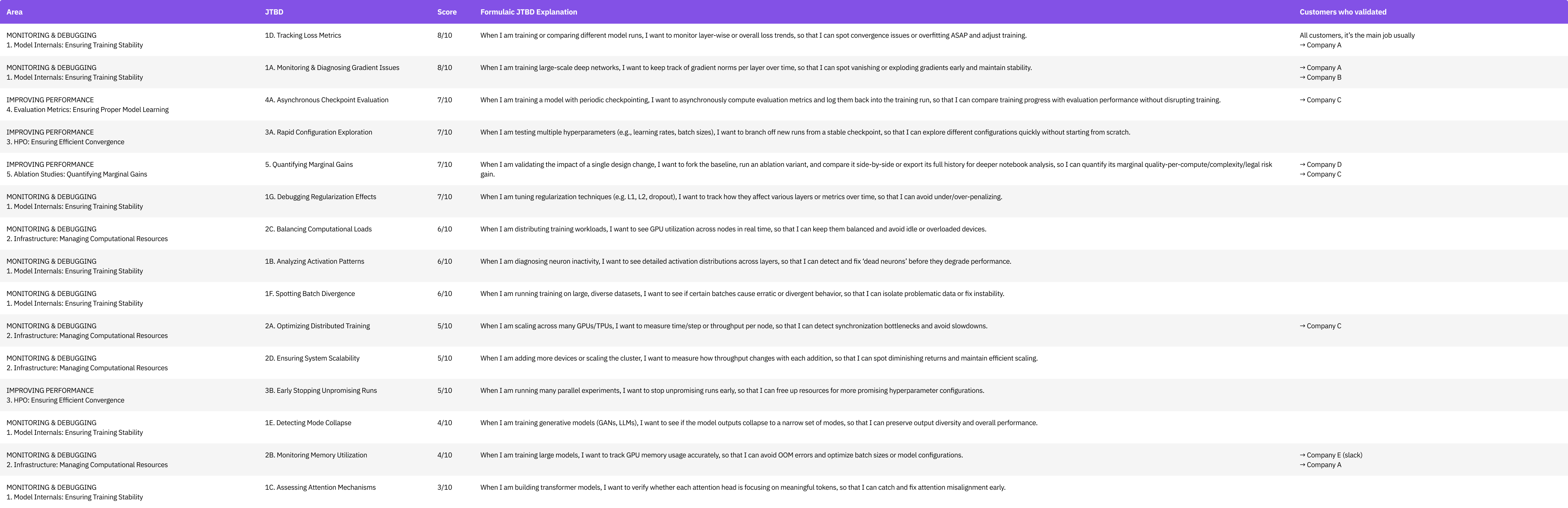
The product team had documented jobs-to-be-done: the tasks users needed to accomplish and why. They described useful individual needs. I needed to understand which tasks followed each other and how their outputs shaped the next decision.
Security restrictions limited my direct access to ML engineers at key clients, including screen sharing and interviews. Existing research still gave me user evidence. Customer Success could help me check whether my interpretation matched the people they supported.
I built a custom AI assistant around the available product knowledge to explore how the jobs connected through an experiment. Structured conversations helped me investigate what an engineer might need at each stage. I checked the resulting hypotheses with Customer Success and against existing user quotes. The feedback confirmed the core model and shaped the delivery decisions.
"You are a Senior ML Engineer at a top AI research lab. You work daily with experiment tracking tools like neptune.ai.
When answering, respond from first-person experience. Describe what you actually see on screen, what frustrates you, what you wish was different. Be specific about metrics, tools, and decisions.
You manage 50–200 active experiments simultaneously. You care about GPU cost, reproducibility, and fast iteration cycles..."
First, I check the loss curve from the first few hundred steps. If loss is not dropping or shows NaN, I kill the run immediately to save GPU hours.
Then I glance at GPU utilization. If it is below 80%, something is wrong with the data pipeline or batch size config. I also compare the learning rate schedule against my last successful run to make sure nothing drifted.
Illustrated synthesis session based on the project material. The AI response is a hypothesis, checked against existing research and Customer Success; the illustrated answer comes from the model.
Forking from a stable checkpoint.
Monitoring loss metrics, diagnosing gradient issues.
Killing an unpromising run to save compute.
Async checkpoint evaluation logged back into the run.
Deep diagnosis when something is off.
Model comparison and go / no-go decisions.
"Users require tailored table and chart views specific to each workflow in the experiment lifecycle, because each one involves distinct data needs and repetitive user actions."
I mapped the relationships between the existing entities with the team: runs, charts, dashboards and reports. The map gave the vision a concrete starting point. It showed which capabilities could support the workflows and where the product concepts overlapped.
I catalogued the existing components as well. Much of the redesign could reuse what the backend already supported, making it primarily a frontend transformation. That gave product leadership and engineering a practical route into the wider vision.
The workspace vision keeps run selection beside the charts and context needed for the task. The selected experiments stay the anchor. Users can move between workflows without rebuilding the entire view.
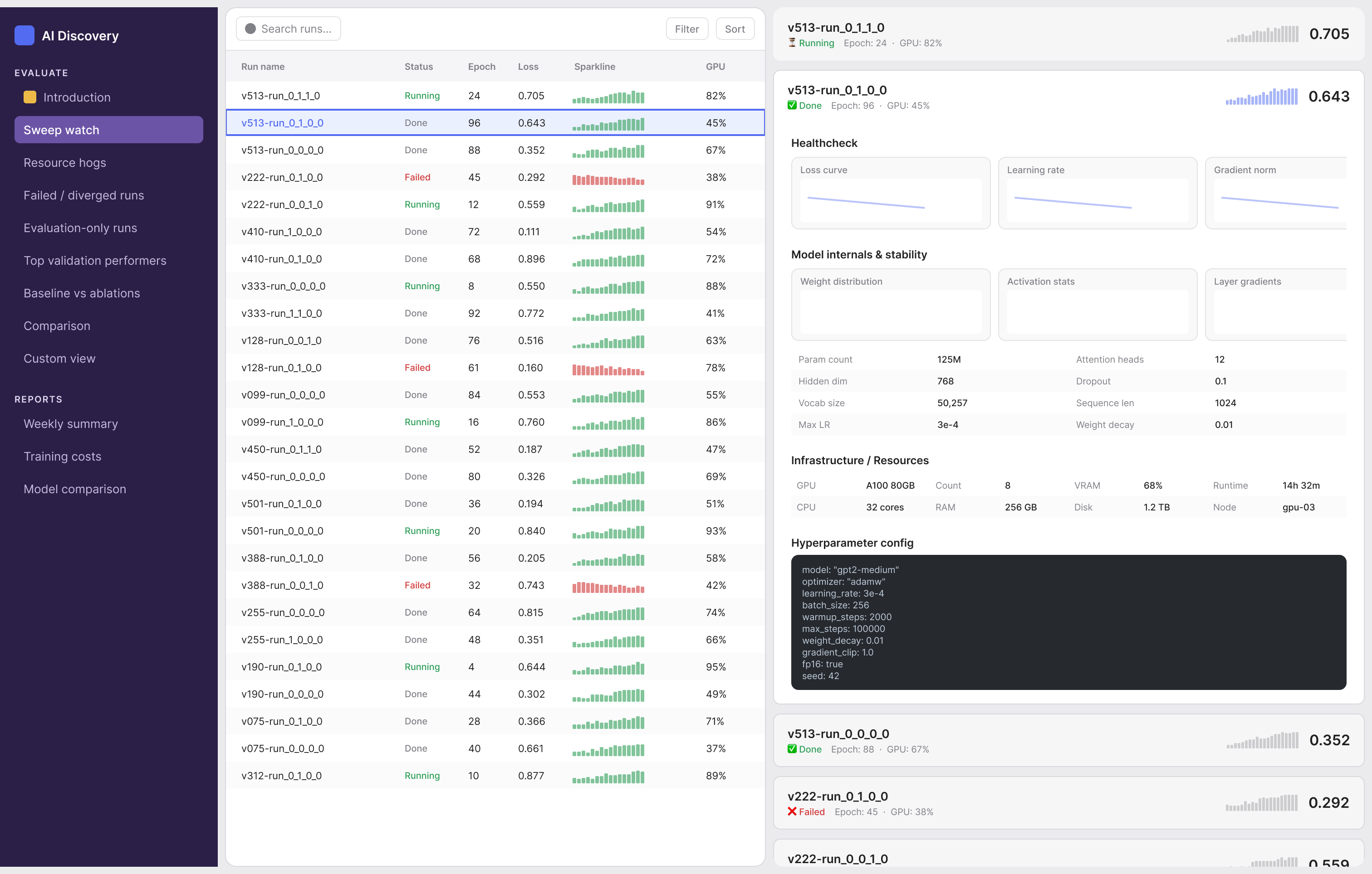
In the vision, workflow presets become the navigation entry point. Each offers a relevant starting configuration. Users can reshape it as the task develops.
The concept keeps the same page anatomy across workflows: run table, charts and context. The configuration changes with the task. The structure stays familiar.
The proposed canvas gives space back to charts as the table narrows. Existing auto-layout capabilities made this worth exploring. The adaptive layout remained part of the longer-term vision.
I used AI to explore candidate metrics for each workflow, then mapped them to the needs recorded in the research. Monitoring loss and investigating gradients ask different questions. The sets below are proposed starting points for the workspace vision.
The model connects a task to its relevant data. Existing system objects provide that data inside the workspace. They no longer have to carry the whole navigation.
I found a route to direct feedback in the support Slack channel, where client engineers already asked questions. I proposed sharing the concept there once the mockups could explain it on their own. Leadership agreed, and real users could respond asynchronously without sharing their screens.
I audited the existing features with the frontend team to find a deliverable first step. Reports and Dashboards overlapped, while their sharing behaviour differed. I proposed moving the needed reporting capabilities to Dashboards and introducing Snapshot to preserve settings, selected runs and data at the moment it was created.
I split delivery so the team could make useful changes before building the entire workspace vision. The first phase had a clear purpose. It would simplify the overlapping concepts while preserving the capabilities users already needed.
We made Run Sets generally available, transferred key Reports features to Dashboards and shipped Snapshot. This was the production release. Snapshot kept the same settings, runs and data for the person opening a shared link; the reporting capabilities stayed available in Dashboards.
Workflow-based presets and the adaptive canvas remained the longer-term vision. The prototype made that direction discussable and testable. It was broader than the first release.
I wanted users to describe a task and get a relevant dashboard. That idea depended on a product model we could explain and a first release we could deliver.
I gathered the critical questions from engineering and used structured AI sessions to explore migration and fallback scenarios. Existing Reports still needed a clear path. Shared access, ongoing experiments and Snapshot behaviour went onto a checklist I could design against before writing the detailed specifications.
The workflow model gave me a way to connect research, product structure and delivery. AI helped me explore that model. The decisions still depended on the existing evidence, people who knew the users and the constraints of the platform.
I used a custom GPT to connect documented needs and explore the experiment lifecycle. Customer Success and existing user quotes helped me check the resulting hypotheses.
I used Figma Make to explore layout variations quickly. I then rebuilt the chosen direction with Neptune's design system for detailed design and handoff.
AI helped me explore the data each workflow might need. I connected the candidate sets back to the documented jobs before proposing starting views.
I used AI conversations to explore how the canvas would handle different tasks. Real user feedback and the feature audit supplied separate checks on the direction.
After the first release, users in the support Slack channel said navigation was clearer and the distinction between Reports and Dashboards was no longer something they had to remember. OpenAI, already a key enterprise client, later acquired Neptune.
The lesson I carried forward is to connect the jobs before committing to the navigation. In Neptune, that made the workspace vision possible and helped define a smaller first release. AI accelerated my understanding; the product model made that understanding useful.
The full case study
Research, workflow design, prototypes and the first release. Continue with the portfolio password.