
Voice-first party game · Own product · 2026

A voice-first game
with its own character.

Good questions kept my kids talking. I built Parlour, a game that reads prompts aloud, to bring that experience to family drives and gatherings. I used AI agents throughout the build and developed checks for the content and motion before releasing it on the App Store.

Founder, designer, developerSoloSwiftUI
View on the App Store
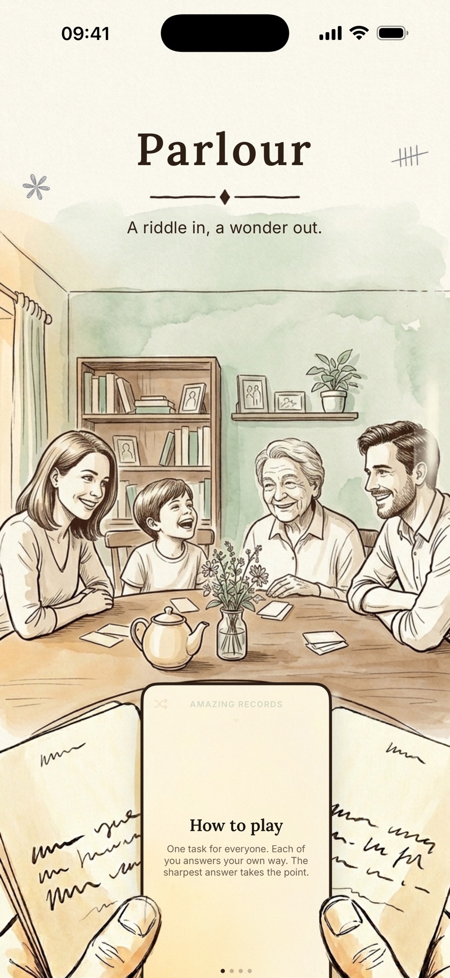
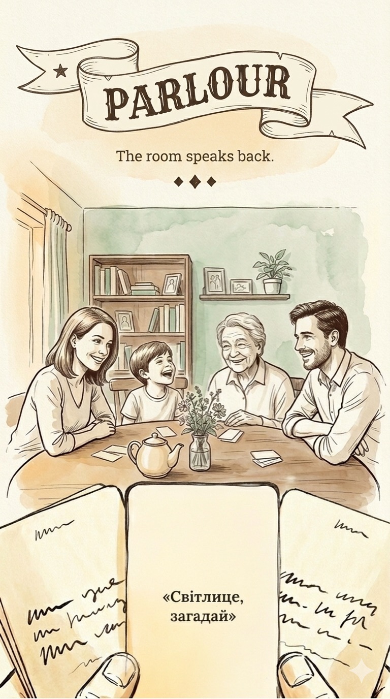
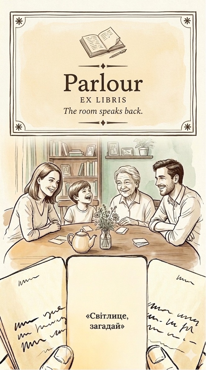
The shipped first screen: the Parlour title over the family illustration, the player's hands holding cards, the How to play card in the middle.
6 wks
Six weeks of work across research, brand, content, design, development and release.
$16
Total spend on all voice generation.
First pass
App Store approval on the first submission, following independent audits and corrections before release.
The niche

The phone could supply the prompt and leave people talking.

I reviewed party games and conversation apps, recording their positioning, mechanics and use of the screen. Heads Up!, Wavelength and Out of the Loop made the screen part of the game.

Party Qs supplied questions for someone to read aloud. I saw an opportunity to deliver the prompt by voice. That became a product constraint: during a round, the phone could be physically present but socially absent.

De-risking

The sound was worth testing before the game existed.

Before the main build, I made a small voice prototype. It had no game logic. I listened to the same prompts on a device and compared how the voices would work in the room.

On-device synthesis was tempting: free generation would have made the content more flexible. The sound mattered more to me. I chose pre-rendered cloud voices, generated once and bundled with the app.

That decision carried into the production audio pipeline. Each prompt was rendered, adjusted to a consistent volume, compressed and recorded in a file manifest. Voice generation cost about $16 in total.

voice-spike
throwaway build · no game logic
Engine test
The system

The product direction carried into the next session.

Parlour needed the same direction across the app, its content and the website. The documents carried that context. I recorded decisions and acceptance criteria in files that focused agent sessions could use as they moved between design and implementation.

The records preserved the choices. Naming kept rejected options and the reasons behind them; generated images kept their prompts so I could revisit a direction later. Development tasks described the expected result and how to check it.

The website made that reuse visible. Its build drew on the existing brand documents, illustrations and narrator audio. I could carry the product into another surface with the same source material.

The operating model has its own case. Parlour shows it in use, with product-specific standards for content, visual direction and motion.

02-strategy/
naming-research-v3-parlour.md voice-generation-research.md competitors/ · 26 files
+ 12 more
03-concept/
non-goals.md product-principles.md mvp-scope.md
+ 4 more
07-content/
quality-criteria.md feedback-log.md tone-of-voice.md
+ 7 more
07-interface/
onboarding-visual-exploration.md icon-system.md siri-crosslocale-invocation-spec.md
+ 6 more
tasks/ 115
verifiable acceptance criteria
decisions/ 94
one record per decision
The app icon

A mark that belonged to Parlour.

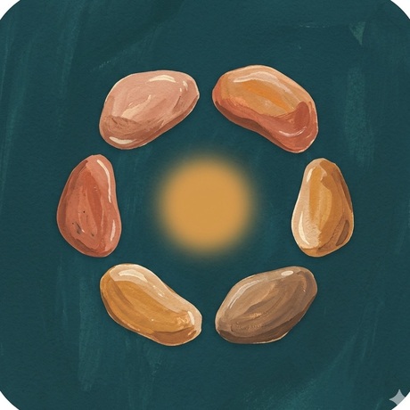
The first icon directions explored different ways to suggest a gathering. Heads, knots, stones and rings gave me a field to compare. I wanted a warm, expressive shape that could hold its character at icon size.

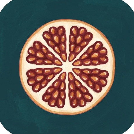
The pomegranate was the strongest visual fit. Its compact form and painted texture worked with the product’s identity. That was what settled the choice for me.

Early icon iteration: five painted heads leaning into a circle around an empty centre.heads Early icon iteration: four painted ropes tied into a single knot.knot Early icon iteration: six painted dots in a ring around a soft glow.ring Early icon iteration: six painted seeds circling a warm light.seeds The shipped Parlour icon: a painted pomegranate cross-section on deep green.shipped Early icon iteration: six painted discs evenly spaced on a thin circle.circle Early icon iteration: a broad ochre brushstroke spiralling in toward a lit ring.spiral Early icon iteration: a flatter, brighter pomegranate cross-section on teal.wheel

The field began with 116 written ideas, narrowed to 20 candidates for review. These painted directions show the exploration around the pomegranate I chose.

The onboarding art

The opening puts you at the table.

I explored photographs, line drawings, painted interiors and notebook-like scenes. Each direction offered a different way to introduce the game. I chose the player’s viewpoint, with cards in their hands and the gathering beyond.

I wanted the person opening the app to feel involved. The scene became an invitation to join the game, and I developed the title treatment around that viewpoint.

The scene: eleven directions, and the shipped point of view standing among them. Hover any tile to read it.

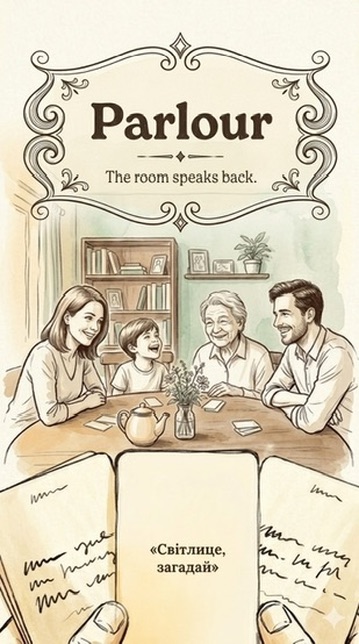
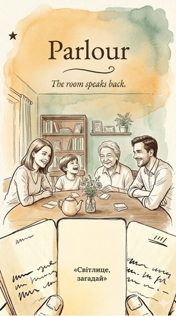
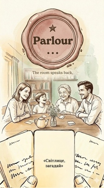
Direction: candlelit photograph, hands and cards seen from above. Direction: clean line art of a family around the table. Direction: oil painting, sunlit room, four players reading a card. Direction: photograph of a family laughing mid-round in a kitchen. Direction: sepia ink and watercolour sketch of the table. The shipped composite: the player's own point of view, cards held in the foreground, the table beyond. Direction: top-down photograph, six pairs of hands around a candle. Direction: a moleskine page, pen and wash study of a player reading by candlelight. Direction: cutaway of a whole apartment block at night, one lit room playing. Direction: oil painting by a window, a child reading the card aloud. Direction: sepia sketch from the player's seat, cards held in the foreground. Direction: sketch with a legible prompt card filling the lower half.

The title block: twelve of its twenty-five lettered variants, each on the same scene.

Title variant: bold serif wordmark with laurel sprigs and pen doodles around it. Title variant: the wordmark inside a drawn ornamental cartouche. Title variant: bold title over heavy ochre and sage watercolour washes. Title variant: light serif title painted over a loose two-tone wash. Title variant: pressed herbarium sprigs in the upper corners. Title variant: the Ukrainian wordmark set small and high in an asymmetric cluster. Title variant: the wordmark carried on a drawn ribbon banner. Title variant: all-pencil treatment, question mark and tally marks in graphite. Title variant: the Ukrainian brand set in a drawn circular vignette with a tagline. Title variant: the title block built as a playing card with corner pips. Title variant: the wordmark stamped into a red wax seal medallion. Title variant: an ex libris bookplate frame with an open-book emblem.
The interface

The notebook idea gave the interface a material language.

A Moleskine notebook gave me the starting point. Paper texture, ink and watercolor offered a visual language I could carry across the opening scene and the game’s controls. I used it to judge how the generated parts fitted together.

The screens had to work as a sequence. I designed the onboarding, game table, how-to-play flow, purchase, settings and states in Figma before implementation. Those mockups gave the build a reference for both the visual direction and the interactions.

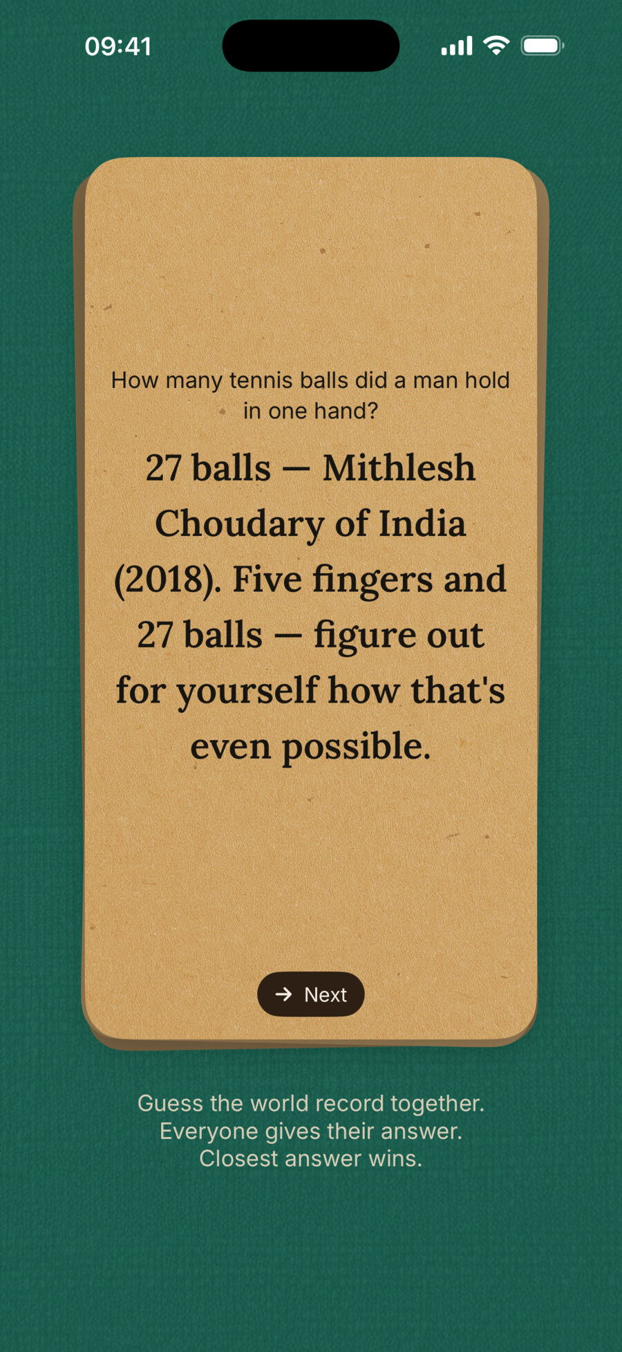
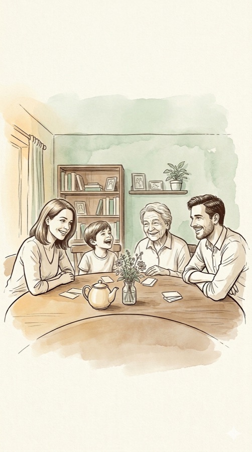
The opening screen: the Parlour wordmark over the watercolour family scene, with the How to play card held in the player's hands. A live prompt on the deep green table: an Amazing Records card asking how many tennis balls a man held in one hand, with settings, Answer and speaker controls. The answer turned over on kraft paper: 27 balls, Mithlesh Choudary of India, 2018, with a Next control.

The shipped sequence: the game's face, a real prompt on the table, and the answer it reads aloud.

The content

A prompt had to start a conversation on its own.

The first generated tasks missed what made the game worth playing. Some were awkward; others gave people little to talk about. I started reviewing small batches and explaining why each prompt worked or failed.

One reaction became a useful test: “So what?” If that was all a prompt invited, it failed. Good and bad examples, with my reasons, became the reference for generation and review.

The evaluator needed calibration too. In earlier rounds, I accepted only 18 to 42 percent of what it recommended keeping. I rebuilt the rubric around more than 120 prompts I had rated myself, with examples explaining each judgment.

The score was a first filter. Generation, evaluation and rewriting ran as separate steps, and factual claims needed checking before a prompt could enter the deck. I read the final content myself after each iteration.

50
prompts reviewed in one round
01Scored Each prompt is rated from 1 to 4 against the written rubric, in a separate session.
02Polished Borderline prompts are rewritten and weak ones dropped. Factual claims are checked before they can enter the deck. That rule followed a batch of invented records I caught during review.
03Read I read the final prompts after every iteration. The system’s recommendation never replaced my own decision.
21
approved in that round

One recorded Guinness Records round: 50 reviewed, 21 approved. The intermediate narrowing illustrates the checks, not measured pass rates at each step. The full release contained 466 prompts.

The motion

A still frame hid the defect between scenes.

I wanted the cards to move like objects with weight. AI could write the spring code, but the first animation jumped between scenes. Asked to check it, the model took a screenshot and reported that it looked fine.

The problem existed over time. In one scene, the card overshot its position and had not settled before the cut. The next scene drew it at rest. A still image could hide the join that felt wrong in motion.

I built the missing check: record the running simulator, extract frames and compare the trajectory with the expected positions. The system could then locate the seam. Here it replaced the spring with a steady ease that landed before the cut.

The recording checked the trajectory. I still judged the feel on the device, tuning it live. The motion values lived in named constants so I could adjust the behavior consistently.

.spring(response: 0.8, dampingFraction: 0.82) Overshoots, and scene 1 ends before it settles
REST SCENE 1 SCENE 2 SCENE CUT · THE JUMP
.easeOut(duration: 0.25) Shipped · lands on rest before the cut
REST SCENE 1 SCENE 2 SCENE CUT · NOTHING TO SEE

Reconstructed comparison of the motion defect and correction. The spring overshoots before the scene ends; the revised ease reaches the resting position before the next scene begins.

The website

The website let people hear the product.

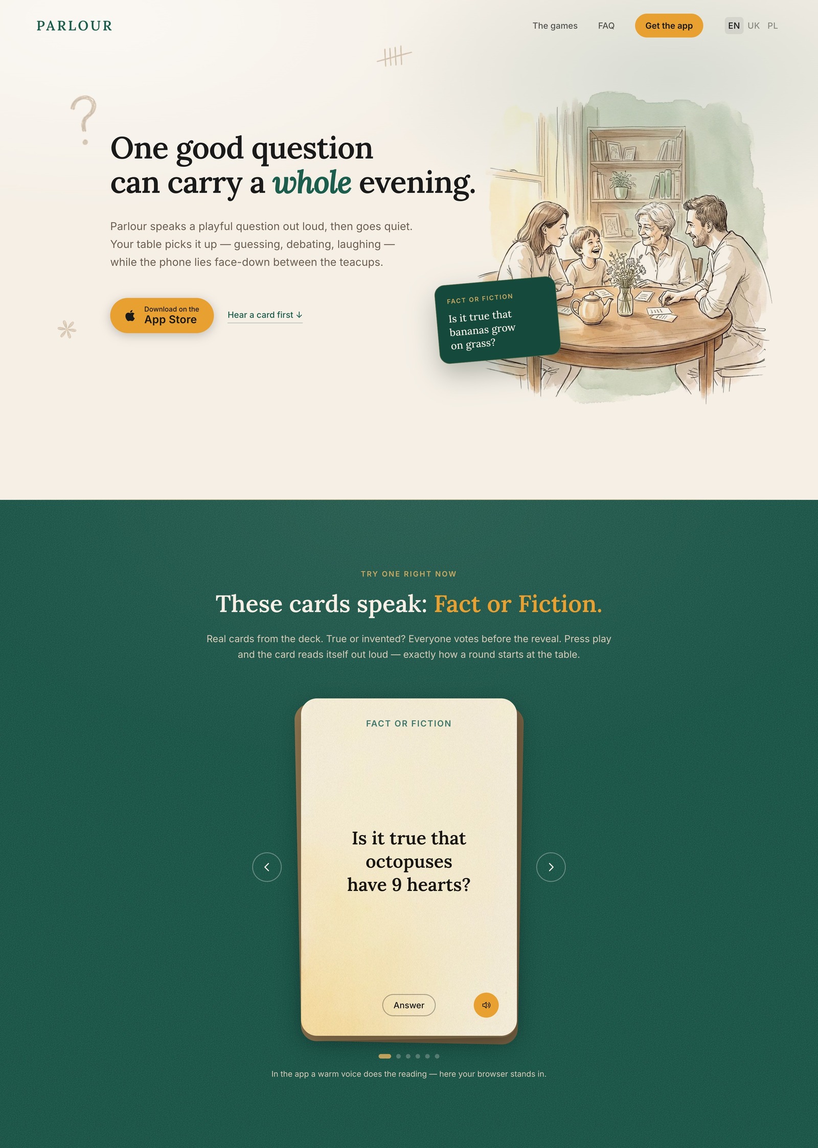
The App Store required live privacy and support pages, bringing a website into scope before submission. The source material was ready. Using the repository's brand documents, illustrations and narrator audio, I built the landing page with AI in about a day.

It also proposed something I had not asked for: an in-browser game demo. A visitor could press play and hear a card in the released narrator’s voice. The site made the experience available before installing the app. Try the game on the website.

brand-foundation.mddocs/02-strategy hero-family.webp storefront-copy-system.mddocs/07-content tof-01.opusthe shipped narrator room-illustration.jpg gemini-final-886d.jsonthe saved image prompt guin-08.opusthe shipped narrator publication-legal-requirements.mddocs/legal
parlour.lazur.io
The live Parlour landing page, first two sections: the hero with the family illustration and the App Store button, and below it the playable Fact or Fiction demo, a real shipped card with arrows, an Answer button and a play button that reads it aloud.
The release

The checks happened before the first submission.

I tested the build on devices at home with my kids. Before submission, I ran four independent audits against the App Store requirements and compared their findings. The reviews caught details I needed to fix.

One was the “siri” keyword in store metadata, flagged as a protected trademark. Others were debug leftovers: an unguarded development import, stray log statements and an over-declared privacy key. I corrected them across five build passes that day.

App Review approved the first submission. It closed the same loop I had used through the build: inspect the actual result, correct it and check again.

Epilogue

I ran the game at home. The kids loved the new tasks. And the kids weren't on the phone.

Parlour made me put words and checks around my own judgment. The content rubric caught weak prompts; the recordings exposed motion defects. I still chose what belonged in the game and judged how it felt. Try a card from the released game, read by its own narrator.

Fact or Fiction

Is it true that octopuses have 9 hearts?

The answer

No: octopuses have 3 hearts, one main heart and 2 gill hearts.