The homepage offered links.
Managers needed a next step.
The old homepage linked to separate tools without helping hiring managers decide what to do next. Support filled the gap. New managers needed a route to their first hire; active ones needed to see the work already waiting for them.
Earlier redesign attempts had stalled over competing priorities. Marketplace offered a starting point. Enterprise still needed its own hierarchy, shaped by company resources, hiring tasks and ongoing contracts.
Limited new-user onboarding
Only 34% of new hiring managers posted a job or made an offer within 60 days. The starting point was unclear. Company policies and first-step guidance were difficult to find.
Disconnected workflows
Jobs, contracts and budgets lived across separate tools. Managers had to navigate between them. The homepage gave them no useful overview of the actions requiring attention.
Unclear self-service
Routine questions about policies and workflows went to customer support. The information existed elsewhere. The homepage did little to make it available at the point of need.

"Previous redesigns had stalled over different priorities. The challenge was to agree on what this homepage needed to do for Enterprise hiring managers."
Context at kickoffThe work changed after the first hire.
I combined hiring-manager interviews, usage data and stakeholder workshops. Each answered a different question. Interviews clarified the work, analytics showed how little the homepage supported it, and the workshop established shared priorities.
Starting a hire and managing work needed different guidance.
New managers needed guidance before they had jobs or contracts to manage. Active managers needed visibility into the work already running. Both needed company information and support within reach.
That split shaped the homepage. First-hire guidance belonged in the starting state; tasks and activity belonged in the active one.
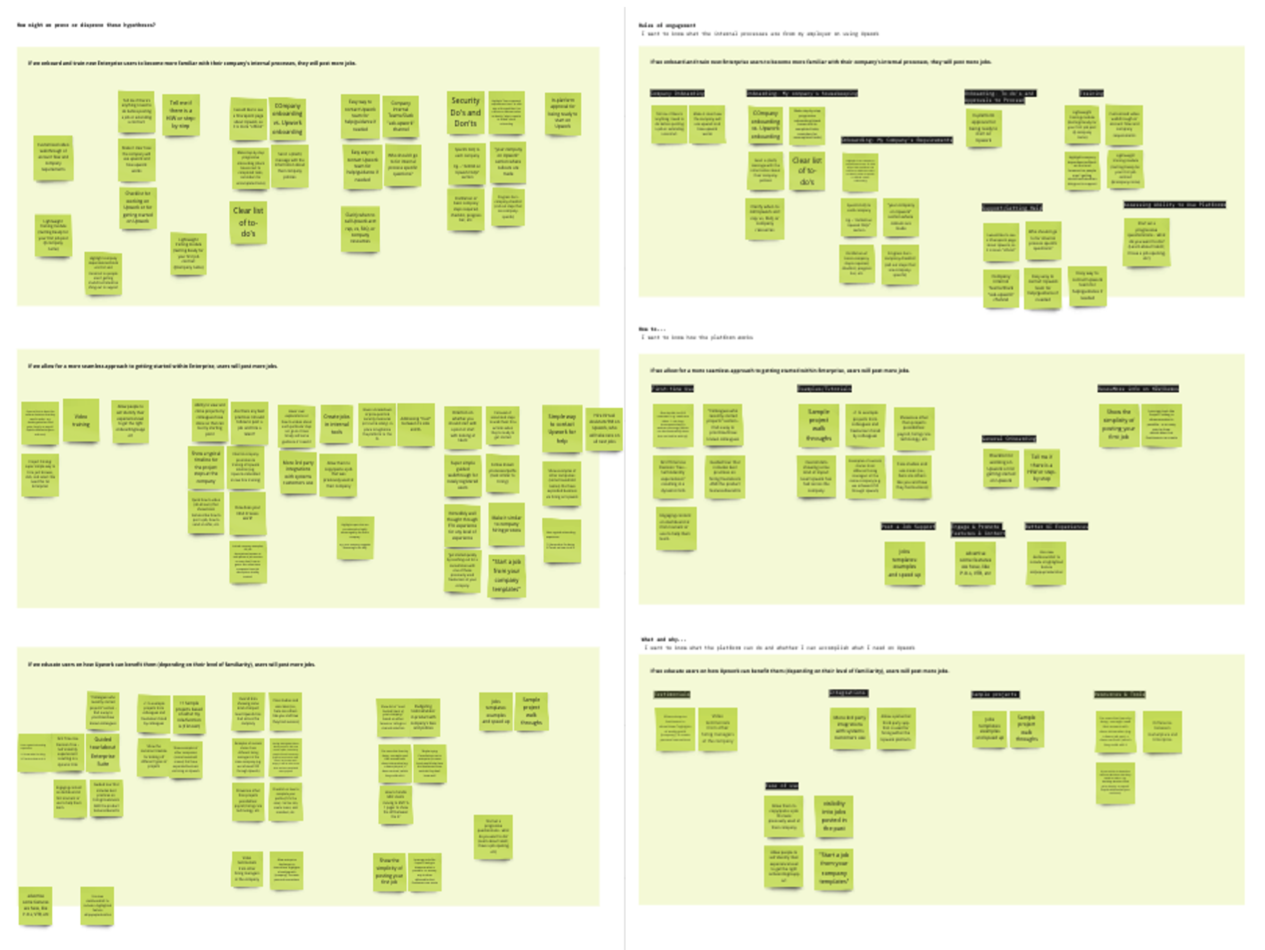
Users went around the homepage to reach their work.
Users often bypassed the homepage and went straight to jobs or contracts. The page offered little reason to stay. I used those paths alongside interview findings to define the work it should bring into view.
Support teams added context about routine questions. Their input helped identify which policies and resources the homepage should make easier to find.

Shared objectives gave the redesign room to move.
I met stakeholders individually to understand their priorities, then brought the findings into an opportunity-mapping workshop. We agreed on shared objectives. Those objectives gave design reviews a common basis and reduced repeated approval loops.
The roadmap carried that agreement forward. Each phase named the user need it would address, so the team could discuss scope against the same goals.
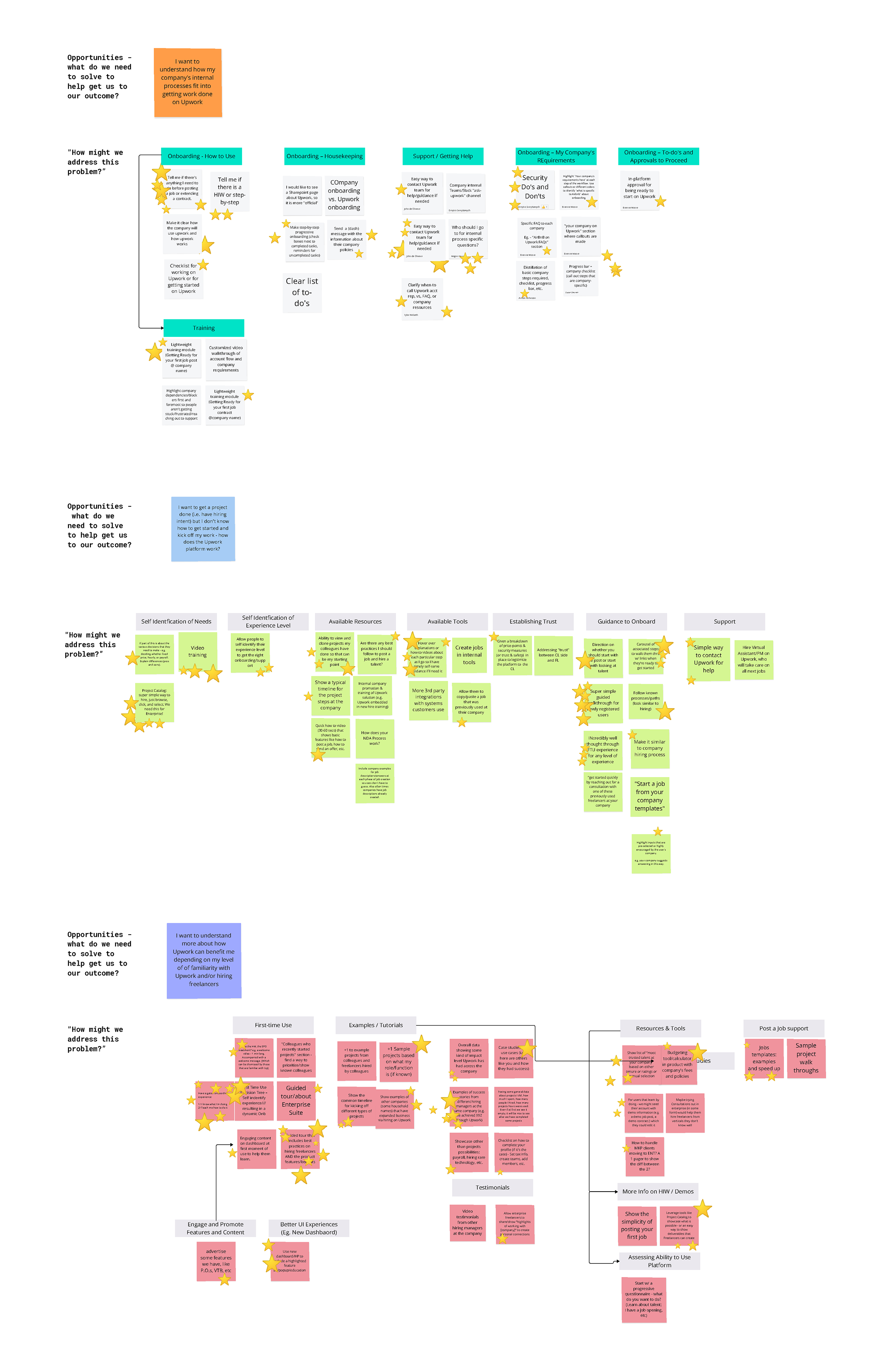
"Shared objectives gave me a basis for design decisions. Reviews could return to what hiring managers needed from the homepage."
Lesson learned from discoveryEach phase had a different job.
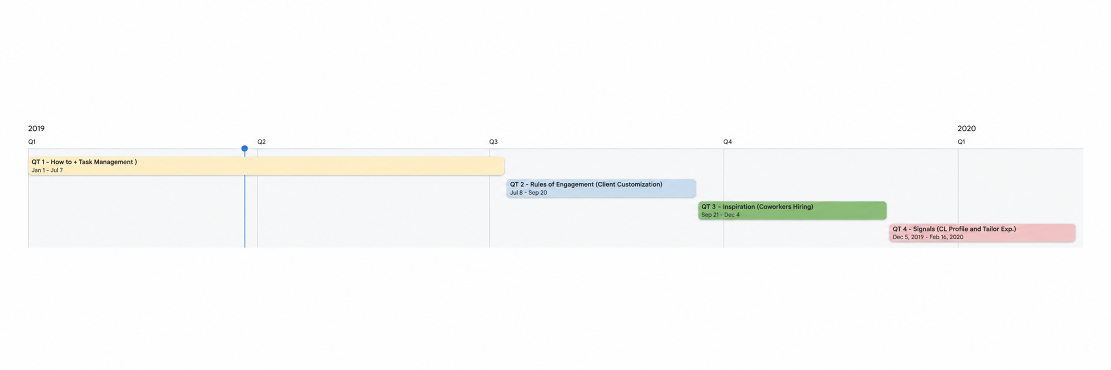
The roadmap separated task management and onboarding from later company resources, coworker hiring and personalization.
The phases had different scope. That kept the next release discussable without losing the wider direction.
How-to & task management
First-hire guidance and a task surface for active managers.
Rules of engagement
Company resources and workflows tailored to the client.
Inspiration: coworkers hiring
Visibility into coworkers' hiring and collaboration.
Signals: profile and tailored experience
Profile signals and a more tailored experience.
Put the next action
where the work starts.
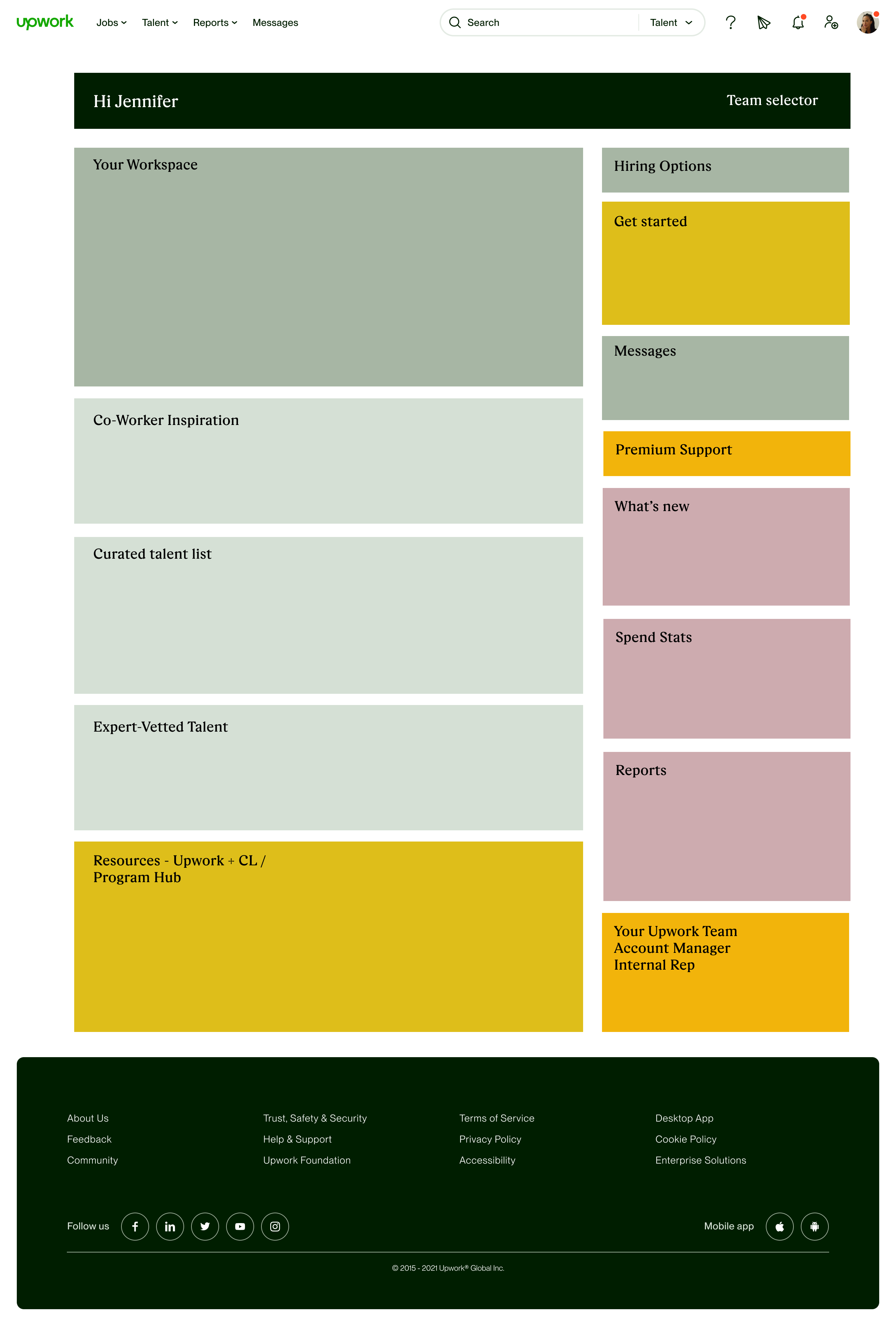
I inventoried the content, then grouped it by the work it supported. Tasks needed priority. Talent discovery, guidance and company resources remained available without competing equally for attention; the same structure could serve both starting and active states.
Every stakeholder saw a different product.
The stakeholder groups brought different priorities to the same page: innovation, consistency, a premium Enterprise experience and reuse beyond Enterprise. I made those priorities explicit. The user findings and shared objectives gave us a basis for evaluating the proposals.
Wanted a direction that showed where the product could go.
Wanted consistency with established components and patterns.
Wanted the workspace to reflect the value of the Enterprise offering.
Wanted patterns that could also serve smaller accounts.




Shared components.
An Enterprise hierarchy.
Testing with new and experienced hiring managers showed where the proposed hierarchy worked and where it needed revision. Quick access to tasks held up. Some Marketplace patterns and stakeholder-requested elements did not fit Enterprise workflows, so we removed them while retaining shared components.

Worked well
- Quick access to core tasks read as the dashboard's main value.
- Content prioritization was understood at first pass.
- Talent-recommendation widget earned unsolicited praise.
- New hiring managers valued the onboarding tools as genuine help.
Needed improvement
- Some Marketplace dashboard patterns did not fit Enterprise workflows.
- Users did not find some stakeholder-requested elements useful.
- Too much information at once. Density was hurting comprehension.
- Power users wanted customization the default layout didn't allow.
- Some Marketplace widgets added friction in this context.
"We kept the shared components and changed the patterns that did not fit Enterprise work. Testing gave us a reason to make that distinction."
Lesson learned from refinementThe task card put
the next action beside the work.
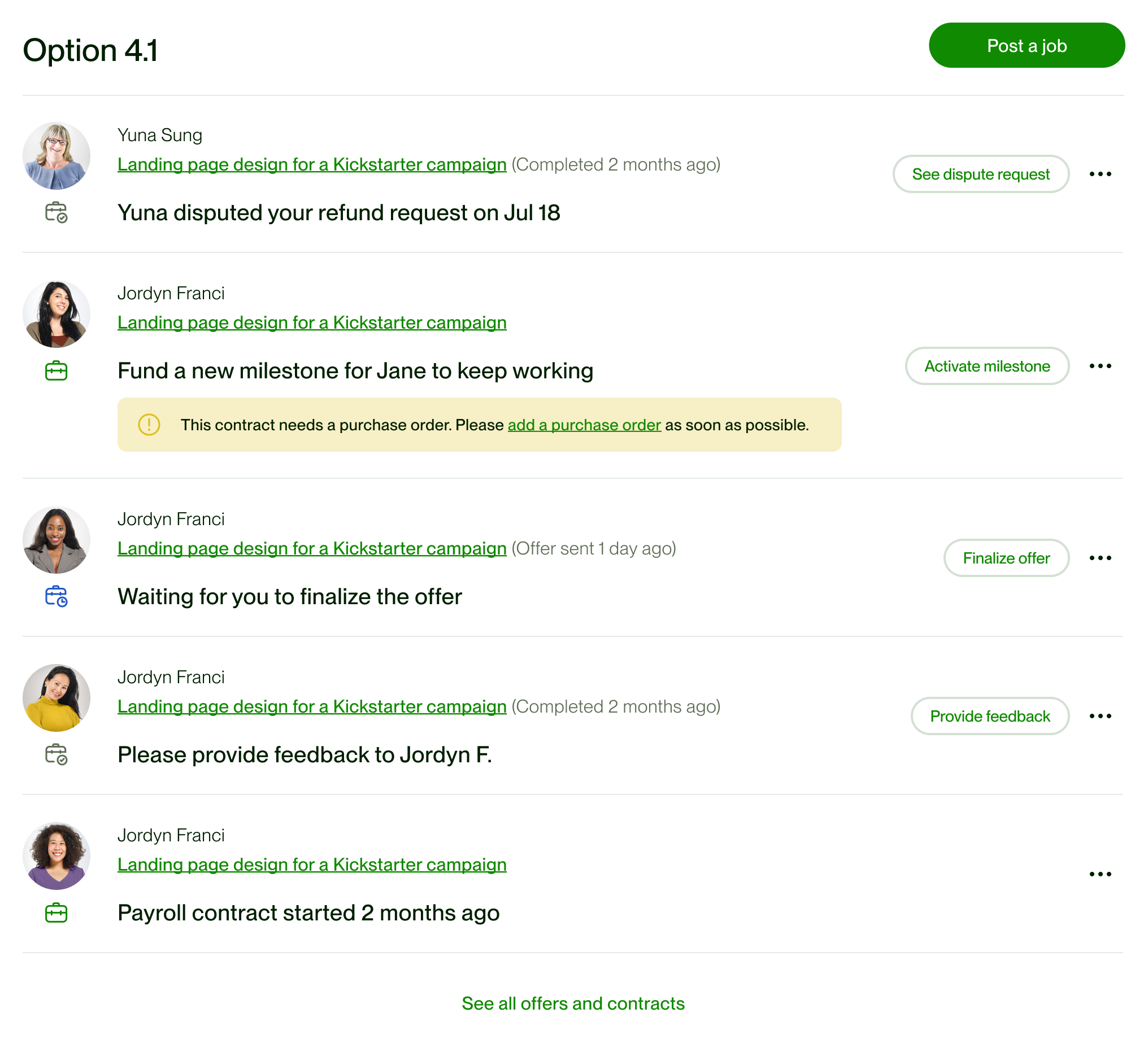
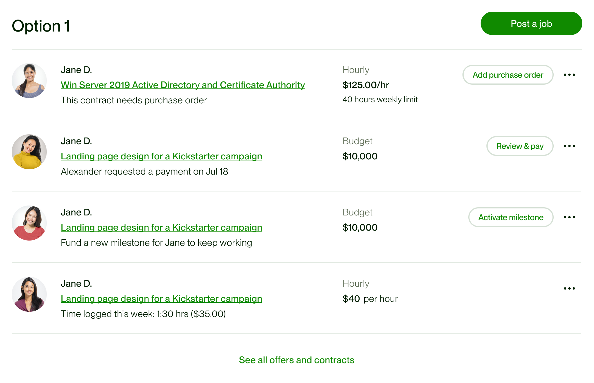
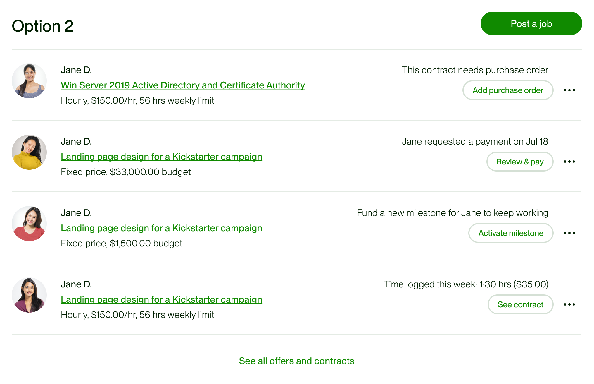
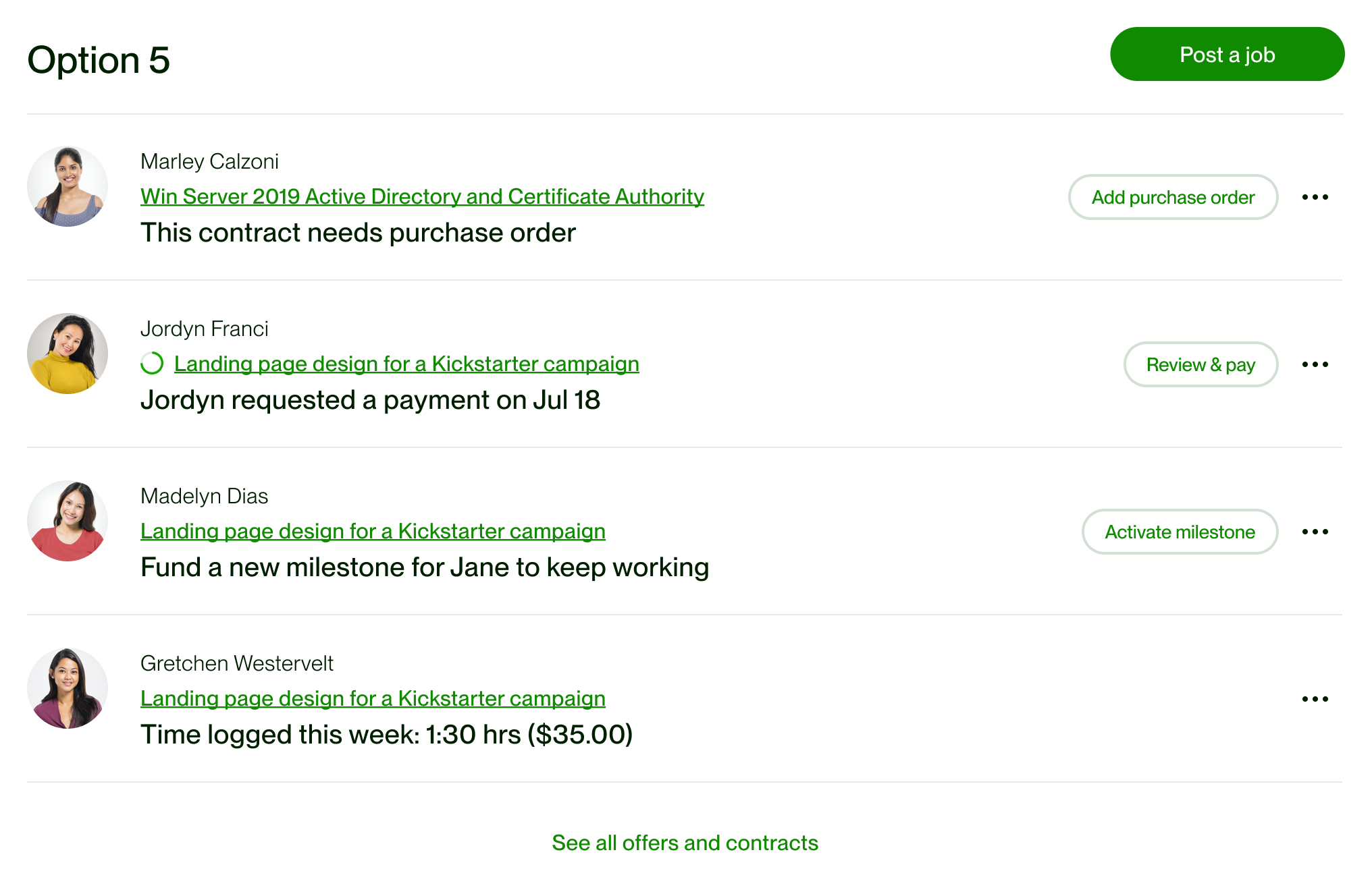
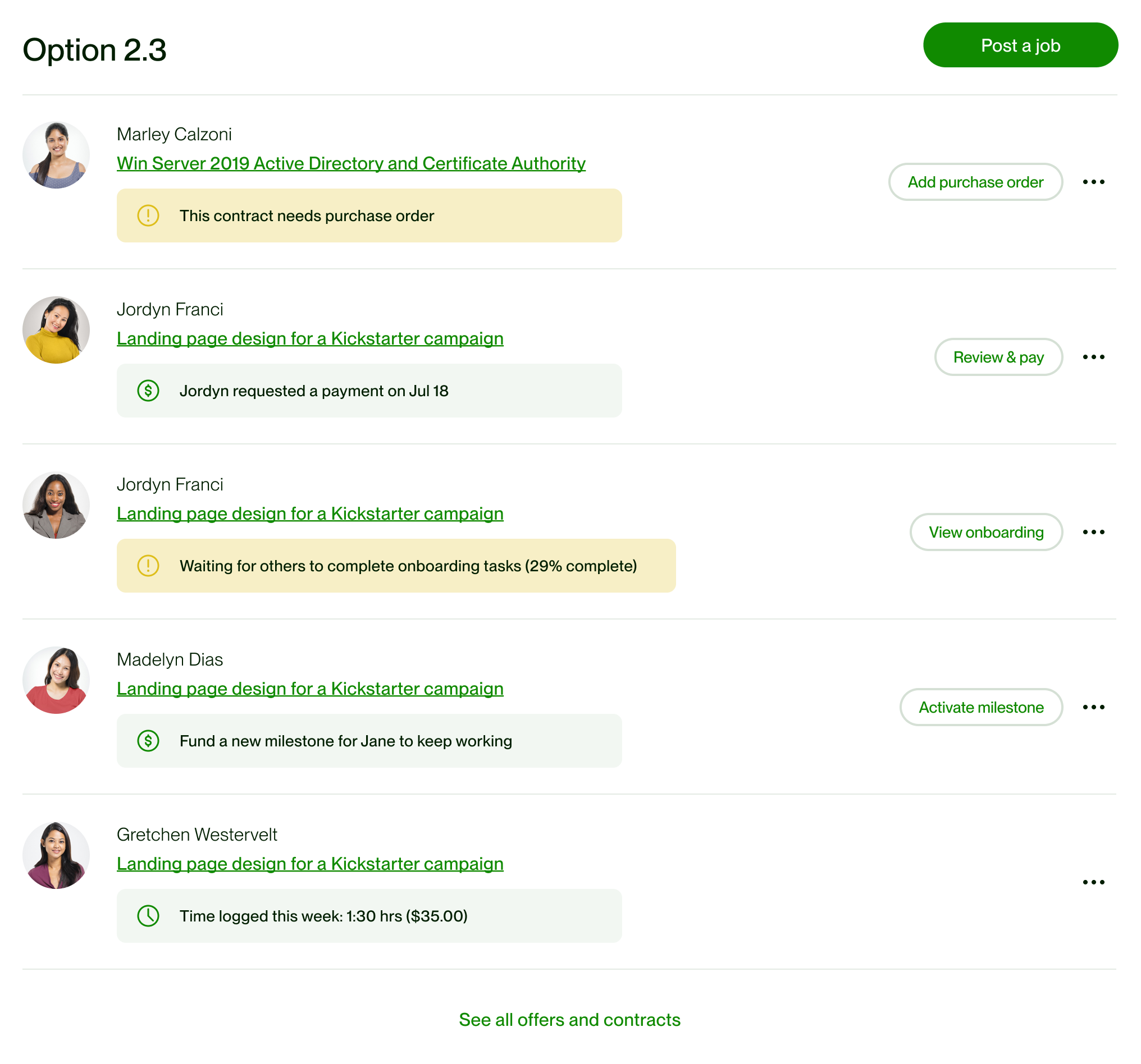
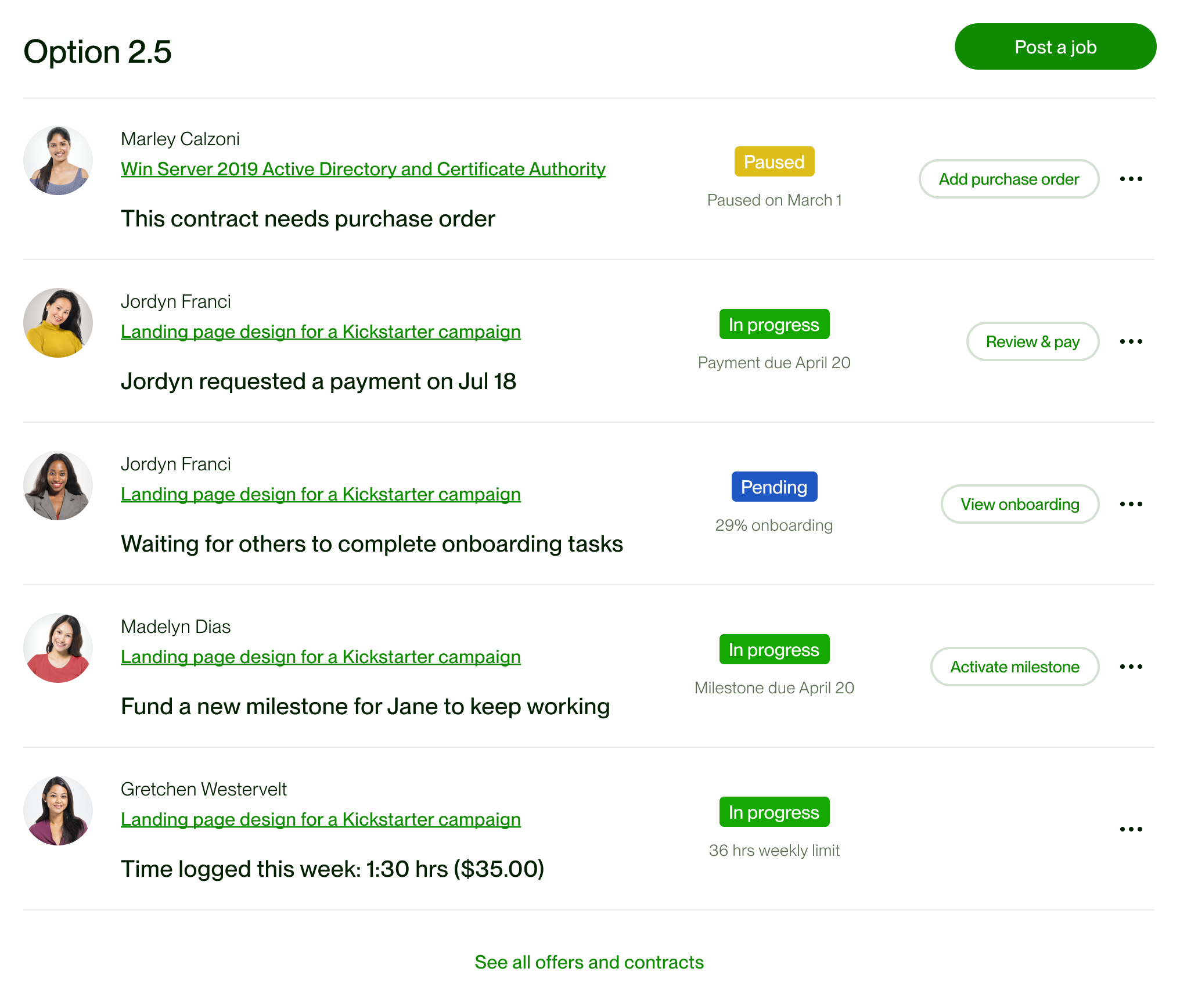
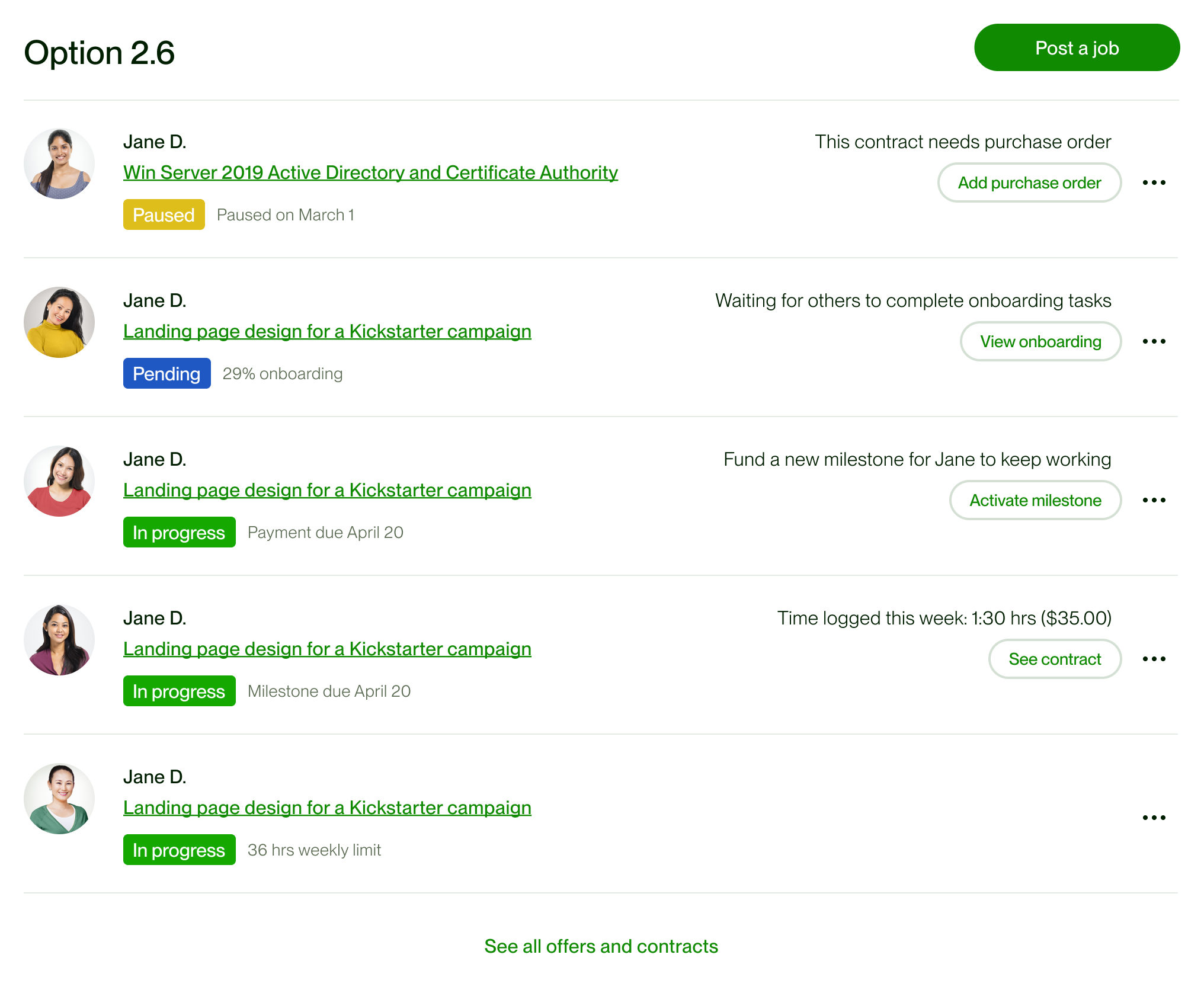
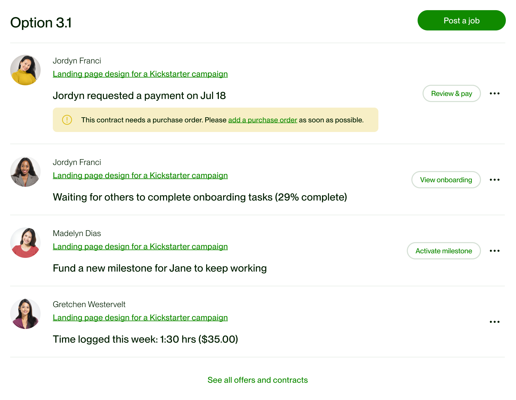
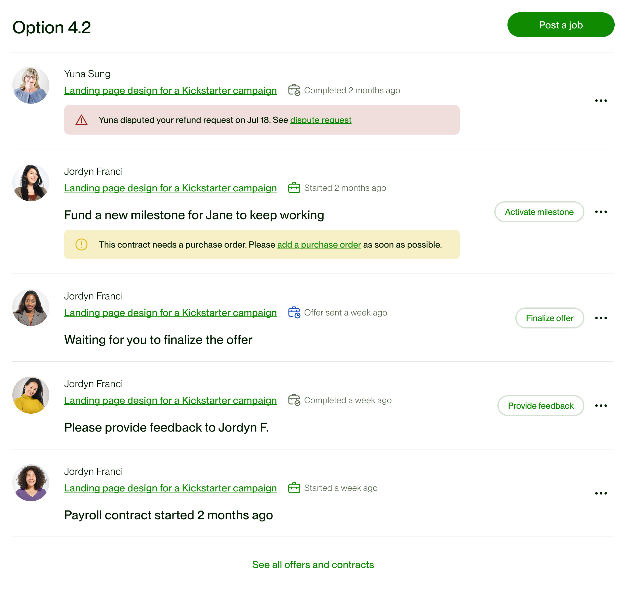
The dashboard depended on a task pattern managers could scan and act on. I explored different layouts. Later passes refined grouping, icons and action placement; the specification brought the variants together across work management, payments, onboarding and disputes.










The hierarchy became a working page.
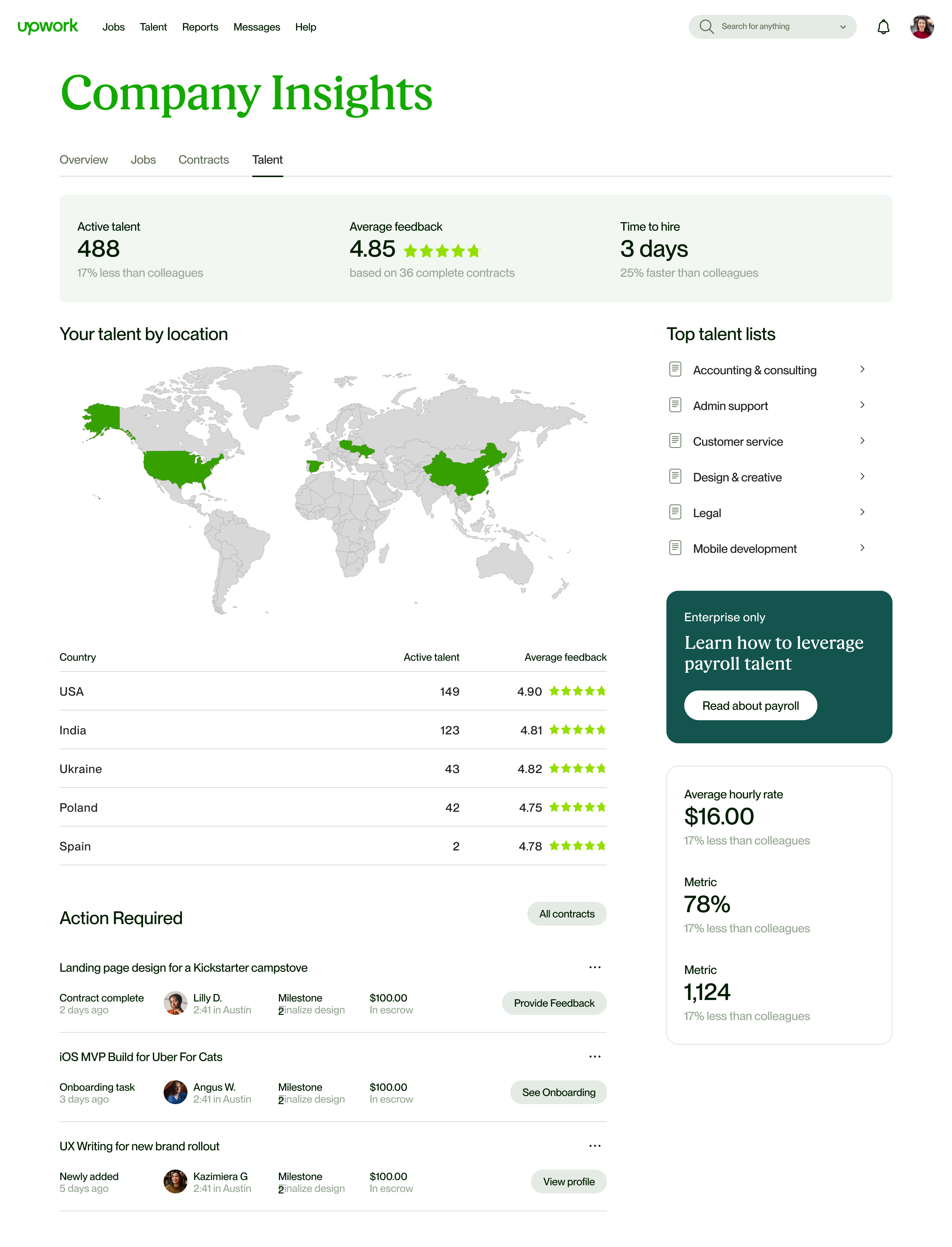
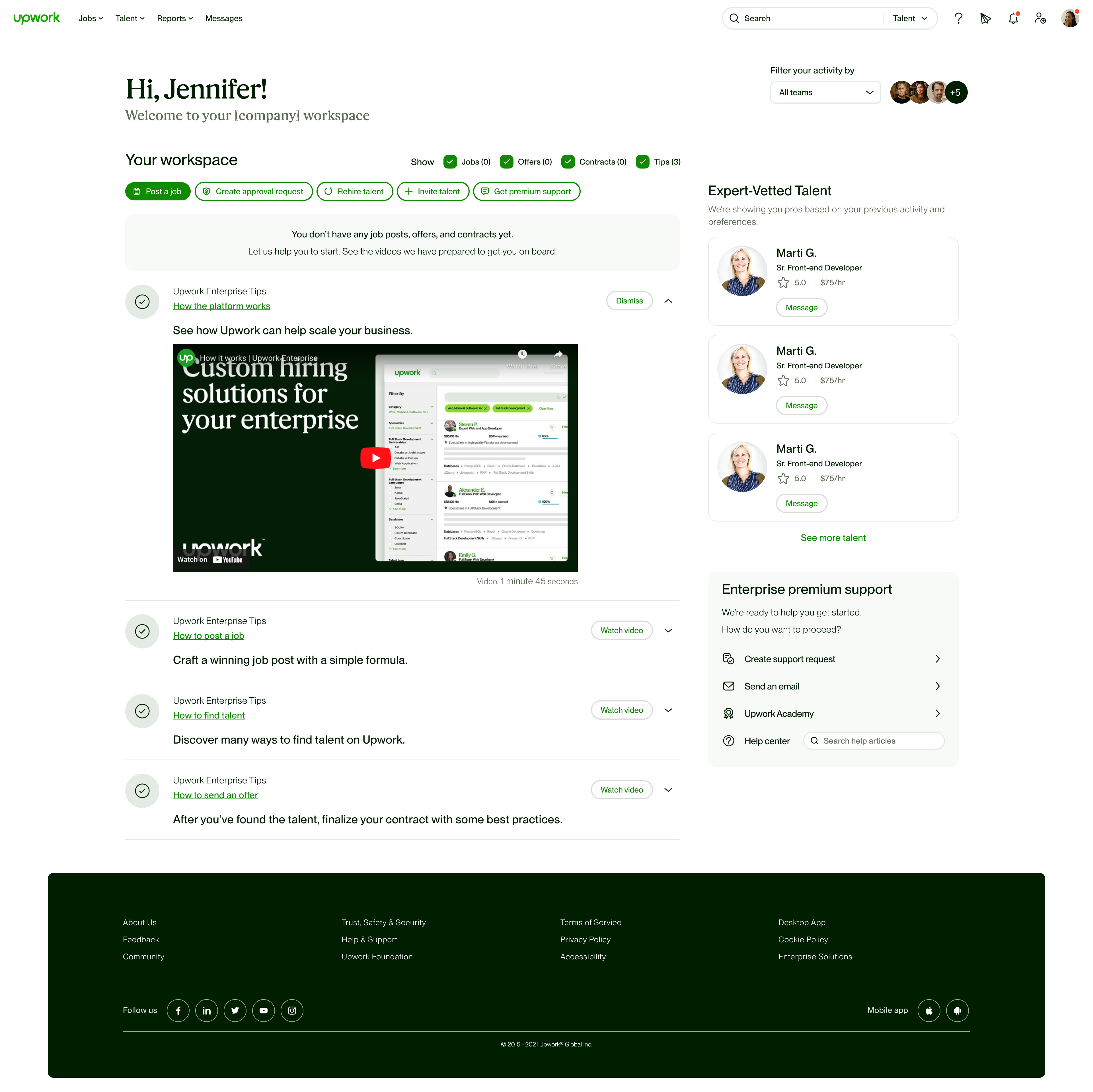
The higher-fidelity explorations show how tasks, guidance, reporting and company resources found their places. The team refined the decisions together. The captions describe the differences visible in each screen.


Hire talent and Manage work have their own task groups. Actions sit beside each task; a reporting strip and talent discovery follow below.

The same structure offers ways to post a job, request approval, bring talent or search. The page still gives managers a next step before active tasks exist.
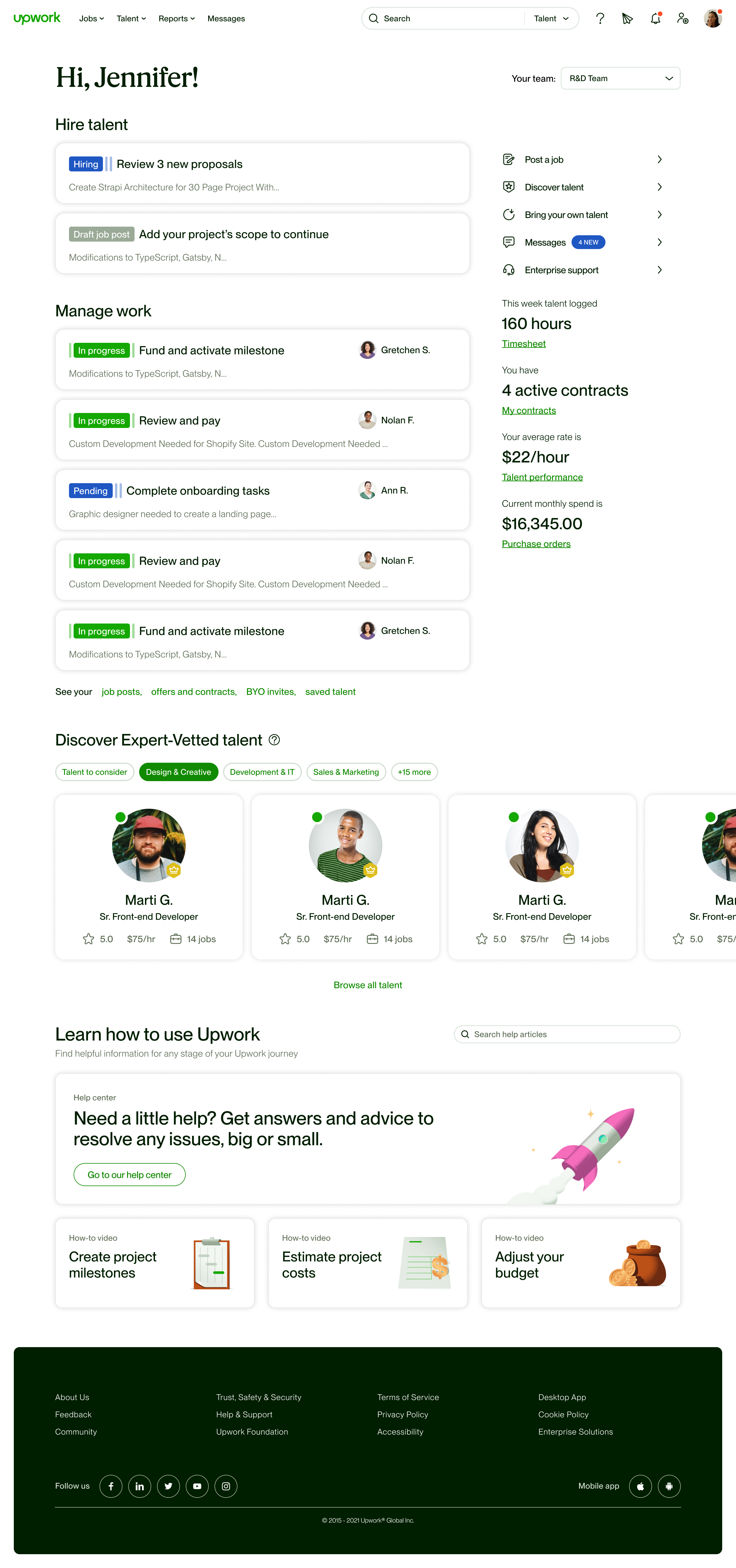
Hiring and work-management cards keep the main column. The right side carries shortcuts, support and reporting links.
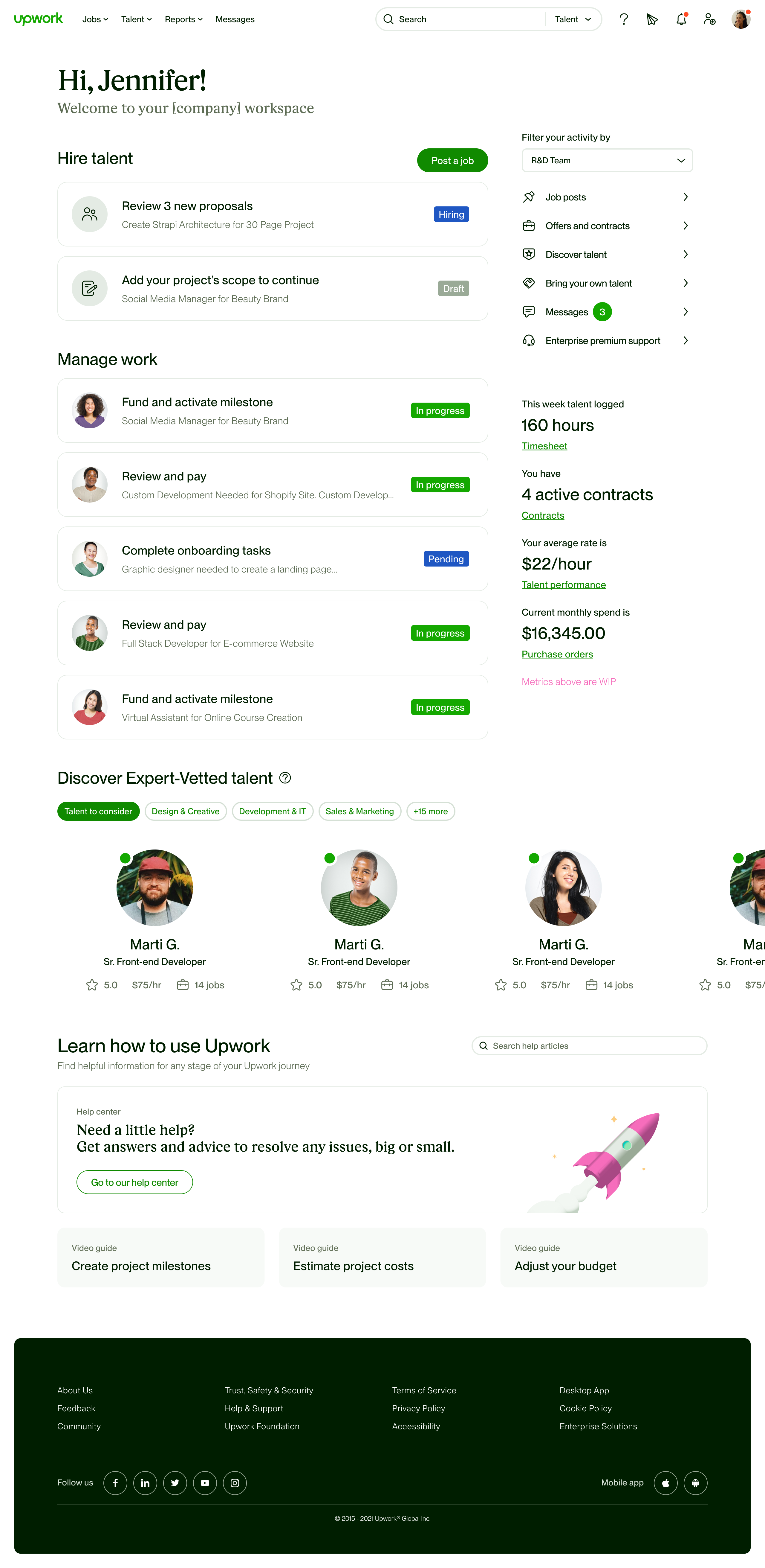
Cards pair each action with its job or contract context and a visible status. A team selector scopes the workspace; reporting and navigation remain alongside it.
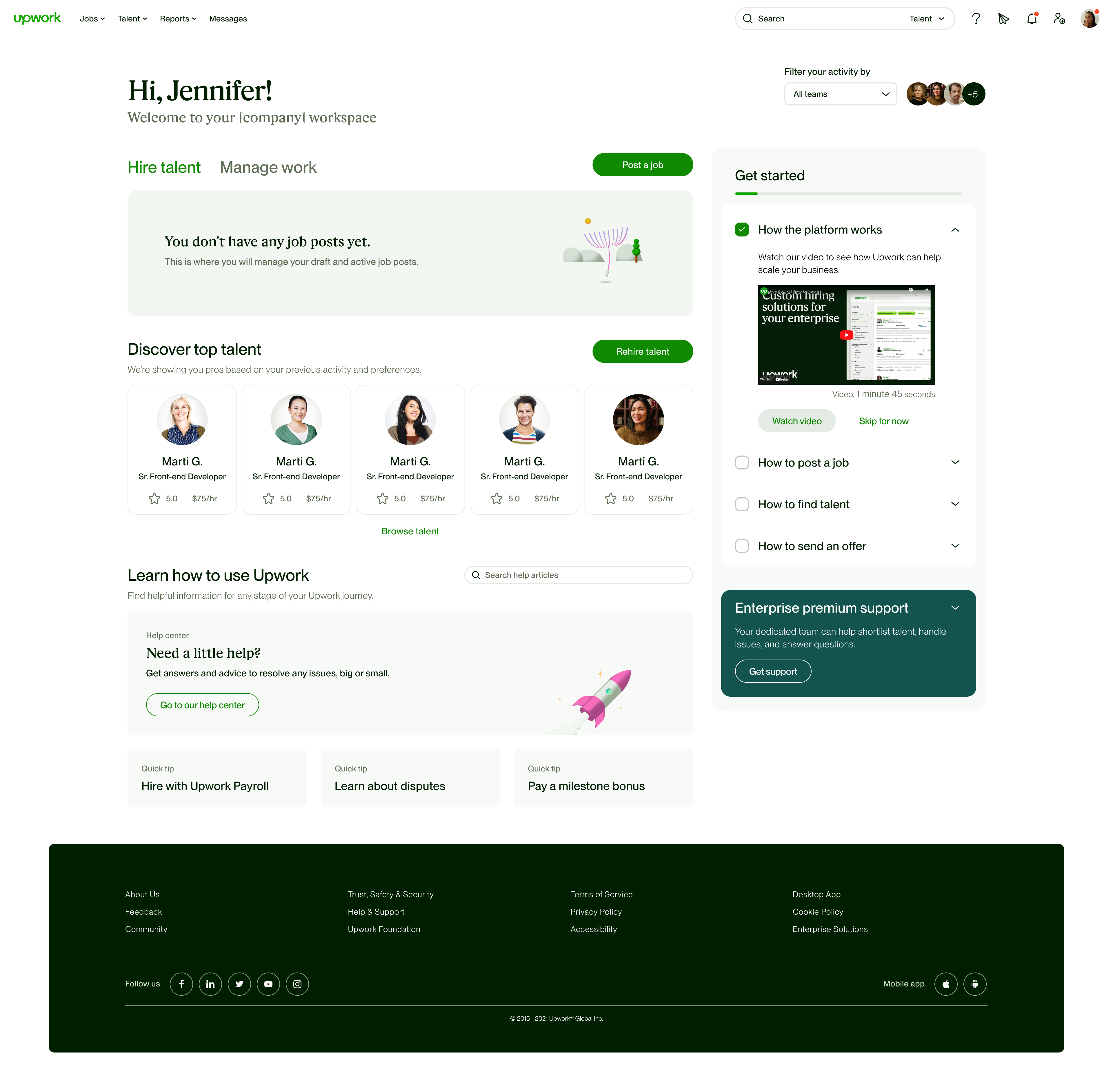
Before a manager has job posts, the page pairs the empty workspace with a Get started checklist and routes to posting a job or exploring talent.

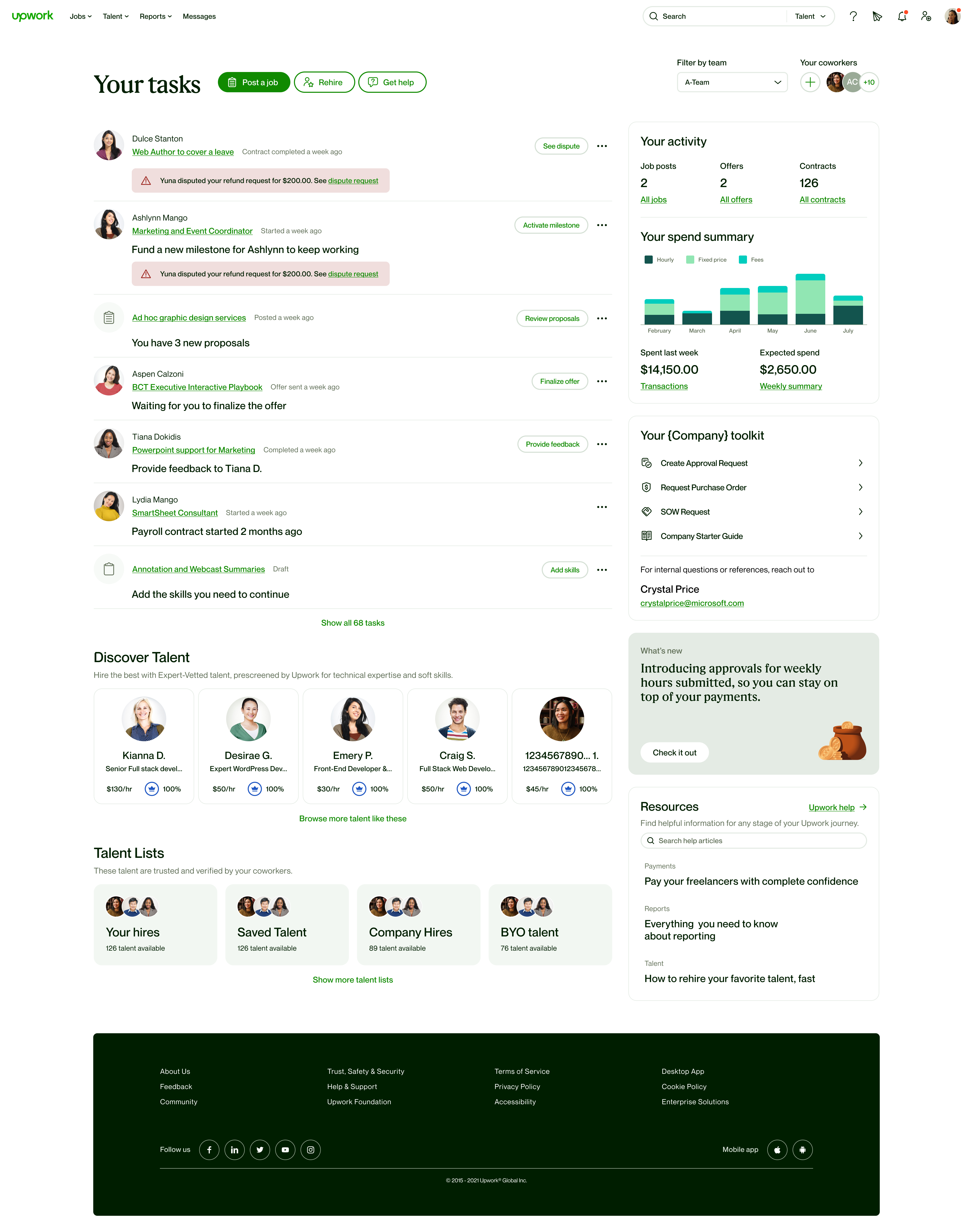
Each row brings together a contract, the next action and any warning. Talent lists and reporting remain available around the task surface.

The company toolkit groups approval requests, purchase orders, statements of work and the starter guide. Managers can reach those resources from the same page as their tasks.

Contract actions occupy the main column; hiring shortcuts, activity and spend sit alongside them. Talent discovery and resources follow below.
Large screens were
the main working context.
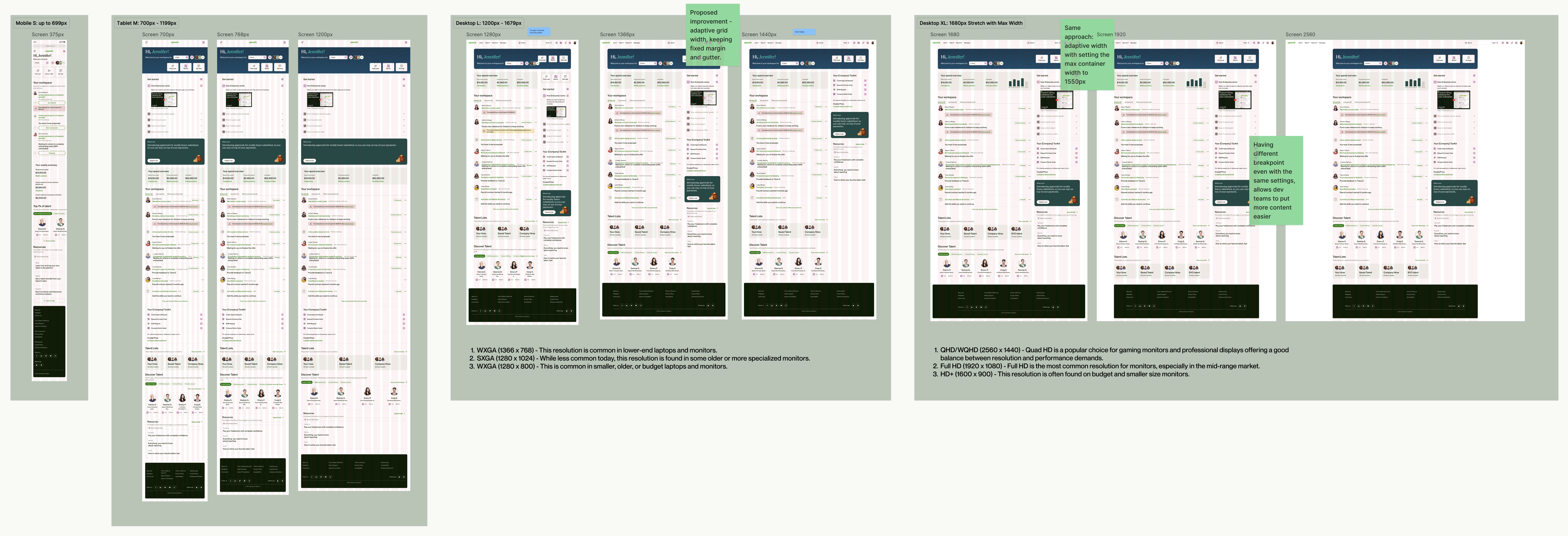
Usage analytics put the large-screen share at 99%. That shaped the grid work. I evaluated the composition across screen widths and proposed an XL breakpoint at 1920px with the design-systems team, so additional space could support the workspace rather than leave its layout stretched.
The task pattern crossed team boundaries.
Task cards had to carry work from several teams. I gathered tasks and notifications across Work Management, Payroll, Onboarding and Disputes, then documented their variants and states. That gave engineering a shared pattern to implement.

Tasks and notifications across project workflows.
Tasks and notifications across billing and payments.
Tasks and notifications across the first-hire journey.
Tasks and notifications across dispute resolution.
One structure.
Different starting points.
The shipped homepage adapted its content to the manager's stage of work. The structure stayed familiar. Guidance led before the first hire; tasks and activity took priority once work was running.
A clear path, guided from step one.
Post a job and discover talent gave new managers ways to begin. Get started explained the first steps. The starting state made the product usable before there were active contracts to display.
Company resources and support remained within reach. Managers could find the context for their first decisions on the same page.
Signal first. Navigation second.
Active managers saw tasks for contracts, payments and ongoing hiring. The action sat beside the work. Activity and reporting linked to deeper views, while the company toolkit grouped policies and processes.
Talent discovery and guidance remained available below the main work. They no longer carried the same priority as tasks requiring attention.
Your Workspace received
the most clicks.
In the 28-day reporting window, Your Workspace recorded 2,497 clicks and Activity recorded 817. Your Workspace led the tracked homepage areas. The report helped identify which surfaces managers used and where to investigate next.
Key solutions from the redesign were later adopted into the Marketplace dashboard. The lesson I carried forward was to define the work first: starting a hire and managing active contracts need different guidance, even when they share the same product.

Next directions
- Refine hiring workflows using post-release behavior.
- Investigate where new managers still need onboarding guidance.
- Explore collaboration for teams hiring at scale.
- Evaluate customization for active managers.
The full case study
Go behind the decisions.
Continue with the portfolio password to read the full case study.
Task cards occupy the main column and messages sit alongside them. Activity counts summarize the work above; reporting, talent and guidance follow below.