Fleet electrification planner · Volvo · 2023–24

The simulator's biggest competitor was Excel.

Volvo's Electric Range Simulator helps dealerships plan battery setups and operating costs for electric truck deals. Dealers avoided it: they exported the data and ran the numbers in Excel. I led the research that explained why, and the redesign that made the simulator the faster path.

Lead Product DesignerSole designer on the projectTeam: PO, PM, 2 BA, 2 FE, 3 BE, dealer reference group (US, SE, FR, NL)
4×
Customer setup cut from 40 minutes to 10, after workflows were rebuilt around how dealers plan a contract.
45%
Higher average satisfaction rating in user tests, compared with the original workflow.
30%
Faster feature implementation by the development team's estimate: modular IA plus reused design-system components.
Overview

Sole designer, end to end.

I was the only designer on ERS. Research, strategy, and design ran through me, from the first stakeholder pitch to the shipped screens. Around me: a product owner, a project manager, two business analysts, and five developers.

Direct access to end users was limited, so a reference group of dealership representatives from the US, Sweden, France, and the Netherlands stood in as power users. They don't run simulations themselves, but they know the selling workflows the tool has to serve, and they reviewed every major step.

Key contributions

  1. Sold a skeptical team on the redesign with a low-risk, phased UX plan tied to measurable business goals.
  2. Pulled usage data from the production database and used it to retire stakeholder assumptions about what dealers needed.
  3. Ran session-recording analysis and interviews across four countries; the travel-plan insight that reshaped the IA came from there.
  4. Rebuilt the information architecture around Simulation as the container, with Routes and Travel Plans as independent, reusable objects.
  5. Validated the new structure in usability testing; the Route and Travel Plan split matched how users think.
  6. Left the team a design system and an analytics tagging plan, so the product keeps learning after handoff.
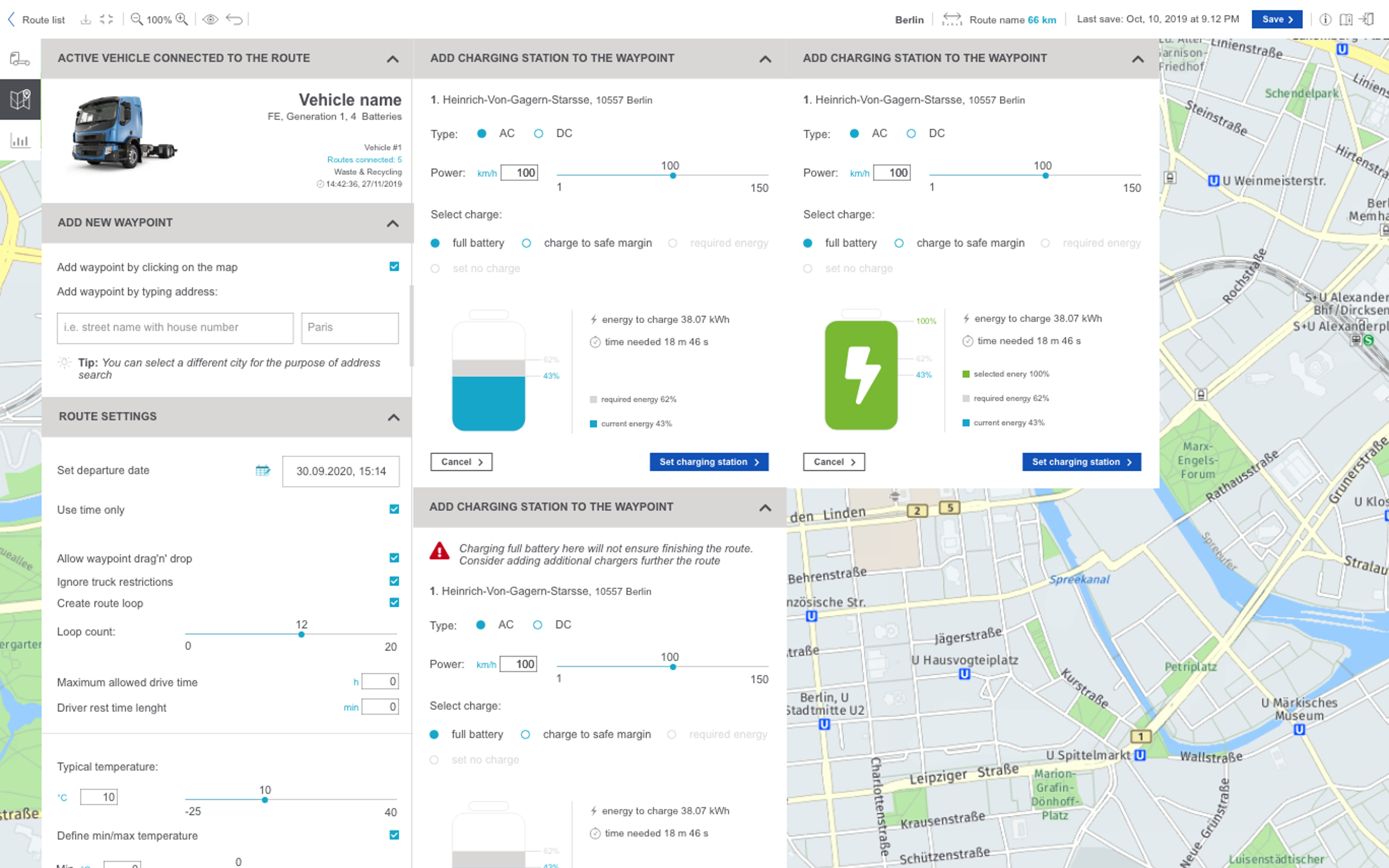
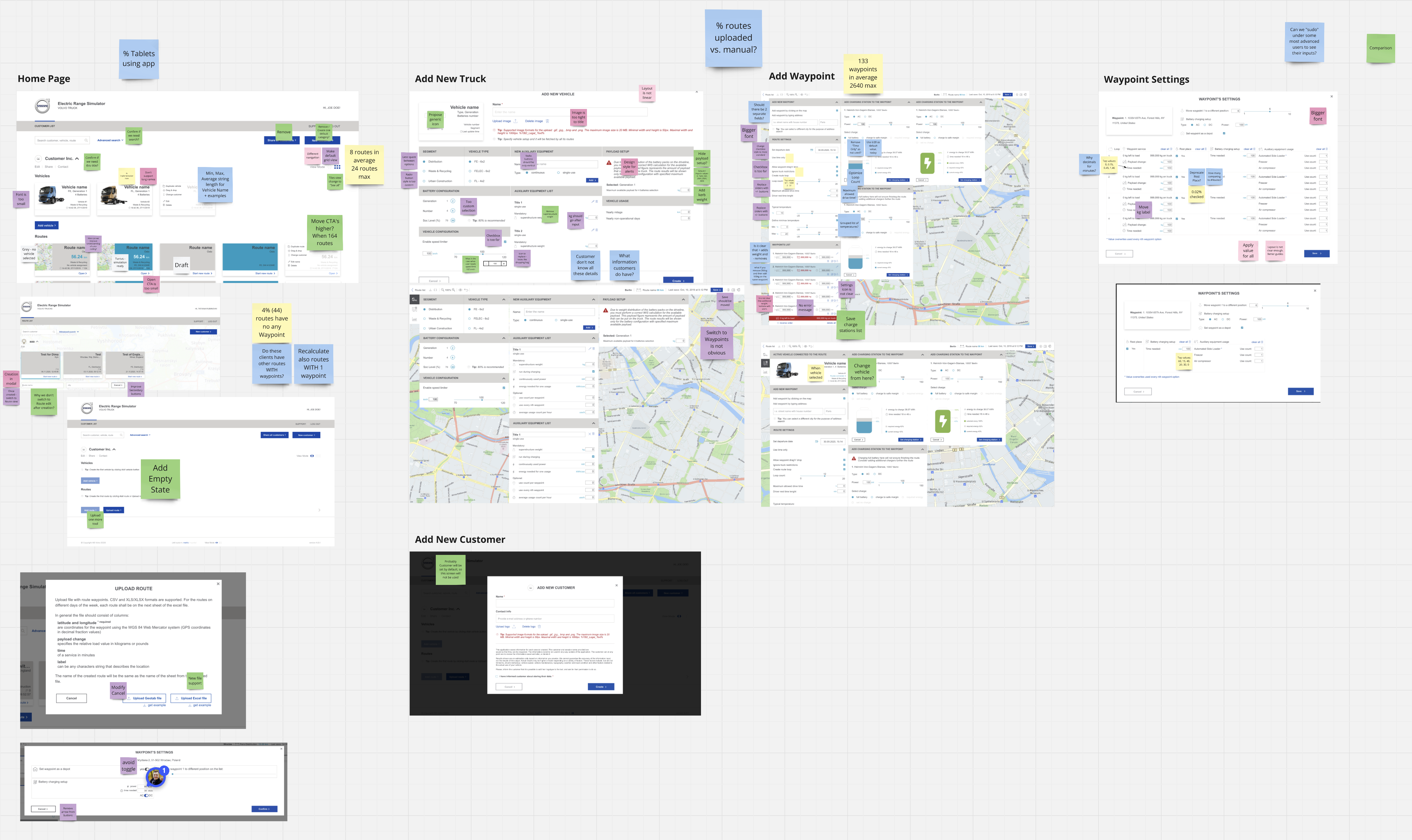
Current-state process map of ERS, showing stacked modal dialogs layered over a route map, illustrating how the legacy interface forced users to navigate overlapping windows to configure a simulation.
Process overview. The current state ERS asked users to work through.
Problem statement

Dealers used it as a last resort.

Selling an electric truck is harder than selling a diesel one. The dealer has to prove the route fits the battery, the charging fits the schedule, and the operating costs fit the contract. ERS existed to absorb that difficulty: simulate the route, size the battery, give the customer a number to trust. Instead it added difficulty of its own. Adoption stayed low, and three problems explained most of it.

01

Undefined product vision

No agreed vision, no value proposition anyone could state. Features came from one product manager's dealership experience, so the backlog grew in whatever direction the latest request pointed. The development team was overwhelmed by work that never added up to a product.

02

Poor adoption

Dealers did the critical work in Excel and opened ERS only when they had to. Setup was repetitive, task navigation disjointed, and errors easy to make. The team assumed end users were too busy to be asked what would fix it, so nothing got fixed.

03

Overloaded interface

Everything on screen at once, with an information architecture that had no room to grow. Key elements carried no priority, so every task started with a search. Each new feature made it worse, because the structure gave it nowhere to go.

01 · Understand

Nobody on the team thought anything was wrong.

ERS had been in development for two years, and the team was deep inside its logic. The backlog was full, stakeholders were wary of change, and no one saw a pressing problem. Before any research could start, I had to make the case that a redesign was worth the risk. The argument that landed: a phased, low-risk plan with measurable goals, built to run alongside ongoing development rather than interrupt it.

UX plan

A plan the team could say yes to.

I framed the redesign as an enhancement of a system that mostly worked, and staked it to goals the business already cared about: shorter simulation times, easier onboarding, higher satisfaction.

  • Expert review and data collection first. Cheap, and disruptive to no one.
  • User interviews and usability testing next, once early findings had earned the access.
  • Recommendations at the end of every phase, so value landed before the next phase started.
Phased UX activities plan board showing research, design, validation, and delivery stages arranged across a timeline.
UX activities plan, staged by phase and dependency.
Defining the baseline

Benchmarks before opinions.

Before proposing anything, I measured the current state, so every later improvement would have a number to beat.

  • Interviewed stakeholders about business objectives and their personal priorities.
  • Walked the critical user flows myself to feel where they broke.
  • Sorted every usability issue into quick wins, critical obstacles, and open questions.
  • Scored the current state against a custom heuristics checklist. That score became the baseline.
Wide horizontal diagram showing the current-state information architecture of ERS as a linear chain of screens and states, revealing disconnected workflows.
Current-state information architecture.
02 · Empathize

The database knew things the roadmap didn't.

Collecting data

Production data over assumptions.

The tool was live, so the production database already recorded how people used it. With the dev team I extracted routes and tracks per customer, waypoint counts with their edge cases, and which features were used or ignored.

The data retired several assumptions. Functions stakeholders considered essential were rarely touched, while users leaned on repetitive workarounds nobody had noticed. Priorities shifted from perceived requirements to observed behavior.

I also proposed a tagging plan for ongoing analytics: abandoned tasks, feature usage rates. The redesign would keep learning after launch.

Synthesis board visualizing production-data findings: route counts, waypoint distributions, and feature-usage rates across dealerships.
Production-data findings. Actual usage, not perceived needs.
Session recordings

Watching a 40-minute simulation fail.

Direct access to users was limited early on, so we recorded sessions anonymously with Hotjar: mouse movement, clicks, navigation paths.

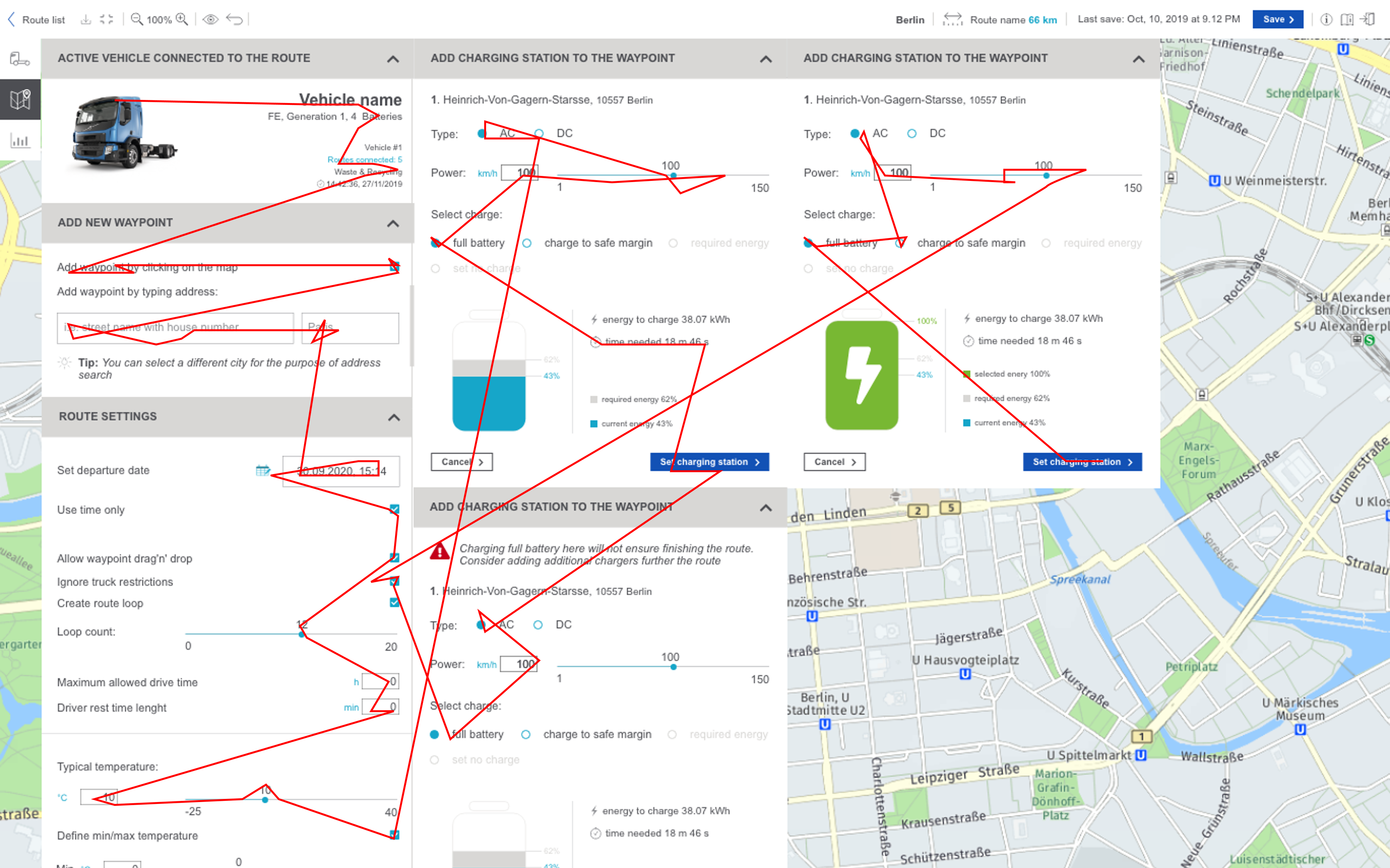
  • Users spent over 40 minutes on a single simulation, failing steps and starting over with the manual open beside them.
  • One session showed a user shaking the mouse in frustration. That clip did more for stakeholder urgency than any report.
  • Navigation bottlenecks forced trial and error where the tool should have guided.

I worked with the legal team to keep the recordings GDPR-compliant and inside company privacy policy. Data sensitivity was a real concern; it got answered, not waved away.

Session recording overlay with a red cursor trail drawn erratically across the legacy ERS interface, visualizing a user's 40-minute struggle to create a simulation.
Session recording overlay. One user's mouse across a single attempt.
User interviews

Four countries, one surprising insight.

The recordings showed where users struggled; interviews explained why. I spoke with dealership users in the USA, Sweden, France, and the Netherlands.

  • Dealers work from specific delivery contracts, fixed garbage-collection routes being the classic case. They need battery plans and operating costs for that contract, fast.
  • Comparing scenarios matters. The same route gets run against different truck models until the cheapest fit wins.
  • The surprise: travel plans. Dealerships kept detailed checklists of waypoints and driver activities outside the tool. The thing users actually planned with had no object in the product.

Users saw potential in ERS; they just could not afford its inefficiencies. The standard workaround was exporting everything to Excel for manual calculation. That single fact carried the redesign case further with stakeholders than any usability score.

Synthesis board from user interviews, organized by country and theme, grouping quotes, tasks, pain points, and emergent patterns around travel plans and scenario comparison.
Interview synthesis across four countries.
03 · Define

Everyone saw the same map before anything got drawn.

Research becomes direction only when the team agrees on what it says. Before design started, the findings went through a readout, an alignment pass with the reference group, and a roadmap.

Present findings

One readout, every source.

Interviews, production data, and session recordings synthesized into a single readout, with each user challenge linked to the opportunity it opens.

Collaborate to align

Map, evaluate, agree.

The team mapped user needs against existing functionality and system constraints, and weighed the trade-offs together. Limitations surfaced here, while changing course was still cheap.

Prioritize and plan

A roadmap for now and later.

Findings became priorities scoped against implementation effort. Immediate fixes went first; structural changes staged behind them.

Lessons learned

Questions are progress.

Every readout raised questions I had not thought to ask. Keeping stakeholders in the loop cost time each week and repaid it each quarter.

Nobody argued with the roadmap, because everyone had already argued with the findings.

Lesson learned from Define
04 · Ideate

The missing object was the travel plan.

The feature audit found inconsistencies and disconnected workflows, but the structural gap was simpler: users planned with things the IA had no objects for. The new architecture started from what dealers handle in the real world. Contracts, routes, travel plans.

Information architecture

Model the domain before the navigation.

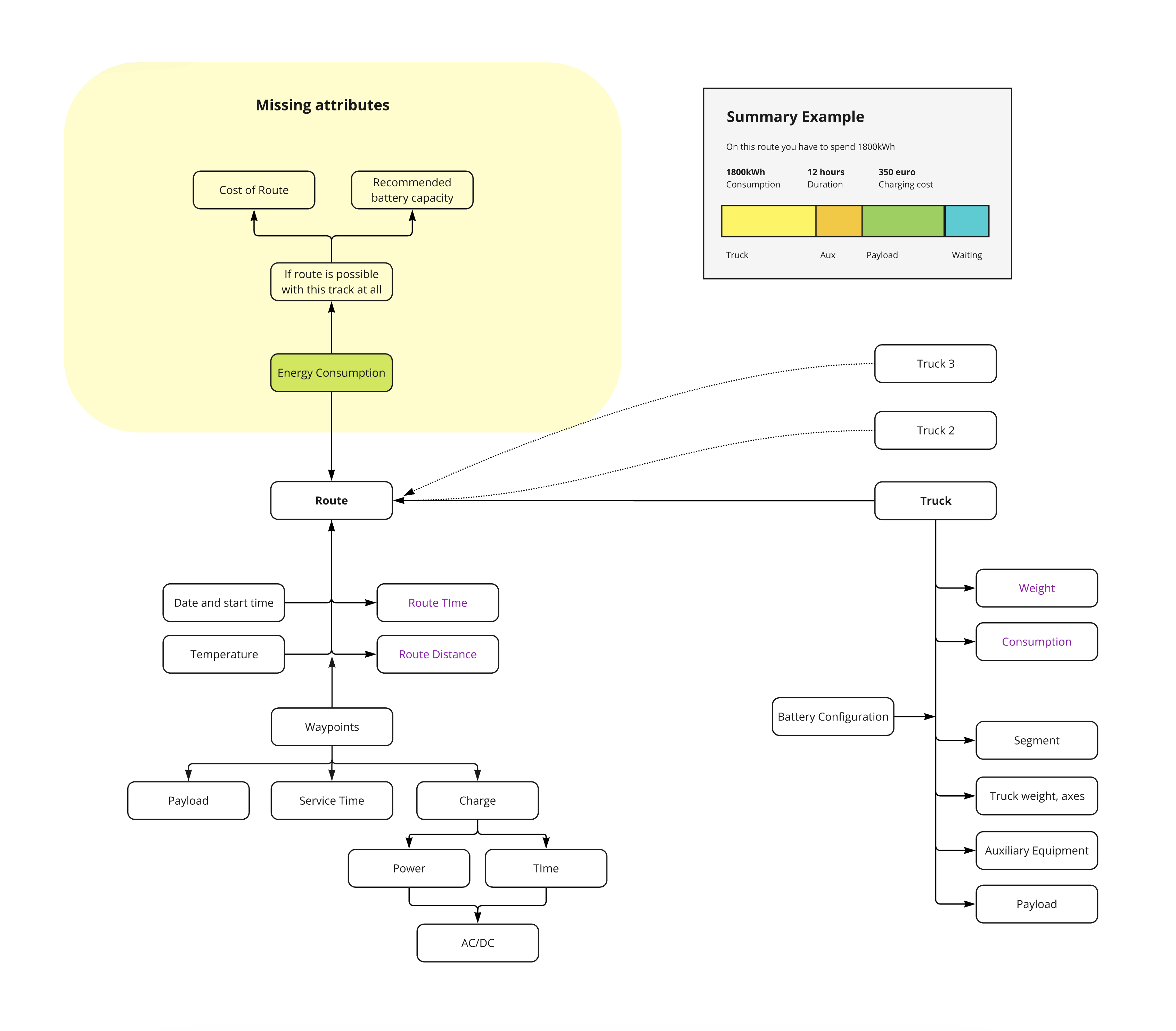
I mapped the domain entities and their attributes with developers and product managers, testing each candidate model against technical constraints before it earned a wireframe.

  • Navigation follows dealer workflows instead of system modules.
  • Travel Plan becomes its own object, taking waypoint activities out of Route.
  • Reserved space for future features, so growth stops costing usability.
Object-relationship diagram mapping Route, Truck, Waypoints, and Battery Configuration, with a highlighted cluster of missing attributes like Cost of Route and Recommended Battery Capacity.
Domain entities and their attributes, with the missing-attributes cluster called out.
Proposed structure

Simulation as the container.

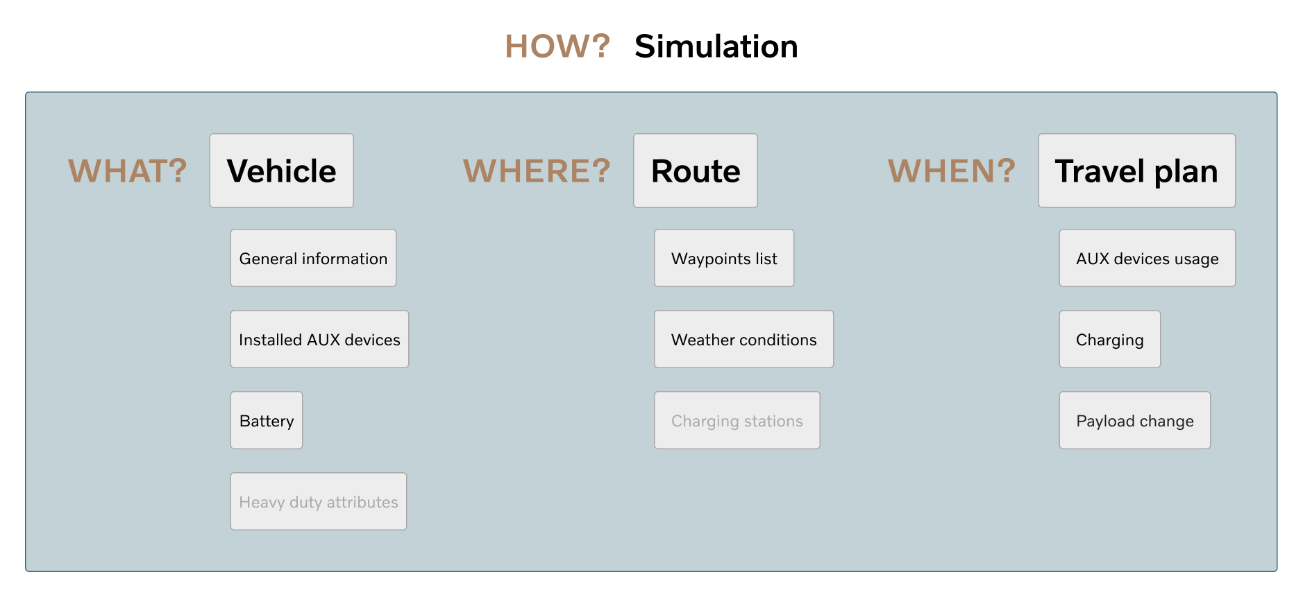
Everything a dealer needs for one customer conversation lives inside a Simulation: routes on one side, travel plans on the other. Activities sit apart from routes, so each can be managed and reused on its own. One container, one context, no page-hopping.

Simplified What-Where-When IA diagram showing the proposed structure: Simulation as container, Routes and Travel Plans as siblings.
Proposed structure. Routes and Travel Plans as siblings under Simulation.
05 · Prototype and test

Low fidelity, deliberately.

Wireframes covered the key workflows: route management, vehicle details, travel plans. Their job was to make the new structure discussable. Cheap to change, easy for developers to estimate, ready to be argued with.

Low-fidelity prototype

The new structure, made visible.

The wireframes put the redistribution on screen: features in their new places, workflows shortened, activities split out into Travel Plan. Developers estimated scope from them. Stakeholders read direction from them.

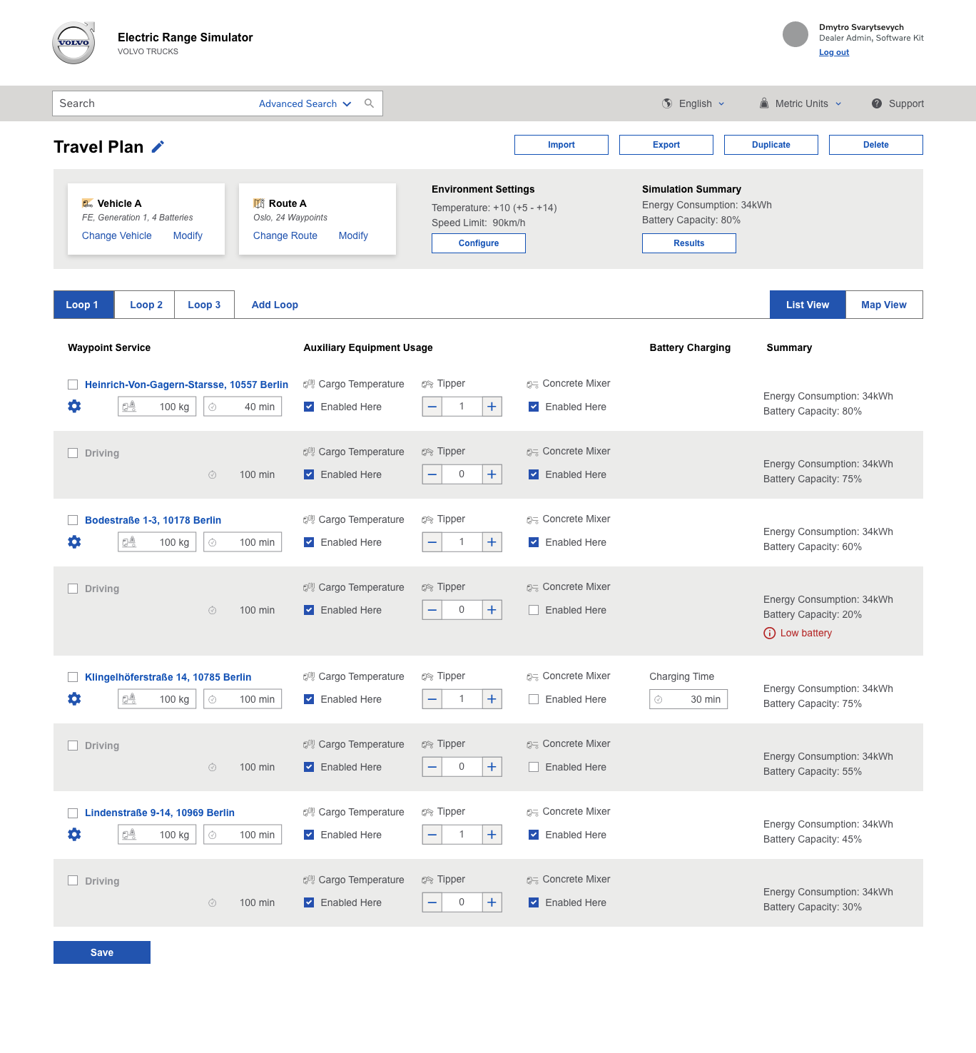
Low-fidelity wireframe of the Travel Plan interface, showing waypoints listed in a spreadsheet-style table with auxiliary equipment, battery charging, and energy summary columns.
Travel Plan wireframe. List view with per-waypoint controls.
Feedback session

A deck built to invite critique.

For the reference group, I packaged the prototypes as a session deck rather than a handoff file. The format asked for critique, which is what low fidelity is for.

Grid of nine slides from an ERS Concepts feedback session deck, covering intro, background, home page, travel plan, results, terms, and conclusions sections used to structure stakeholder conversations.
ERS Concepts feedback session deck.
Usability testing

The mental-model split held up.

Users ran the key workflows on the prototype: creating simulations, managing routes, switching vehicle configurations. The Route and Travel Plan separation matched how they already think about the work, and the navigation confusion went with it.

Testing also flagged the refinements: label wording, navigation paths for edge cases. The strongest positive reaction of the round went to real-time energy feedback while editing a travel plan. That confirmed where the tool's value sits.

06 · Iterate

Closing the gaps testing found.

Each usability gap from testing got folded back into the IA without breaking the structure that had just been validated. The final hierarchy keeps navigation simple and leaves room for features that do not exist yet.

Long horizontal strip of roughly fifteen wireframe and mid-fidelity iterations arranged side by side, documenting the evolution of the Travel Plan and surrounding screens over the course of the redesign.
Iteration strip. Scroll to browse the full sequence.

The iteration strip is long because low fidelity is cheap. Every expensive decision in the final design got rehearsed here first.

Lesson learned from Iterate
07 · Final designs

Four pages, each shaped by a finding.

Page 01 · Customer profile

Structured around how dealerships work.

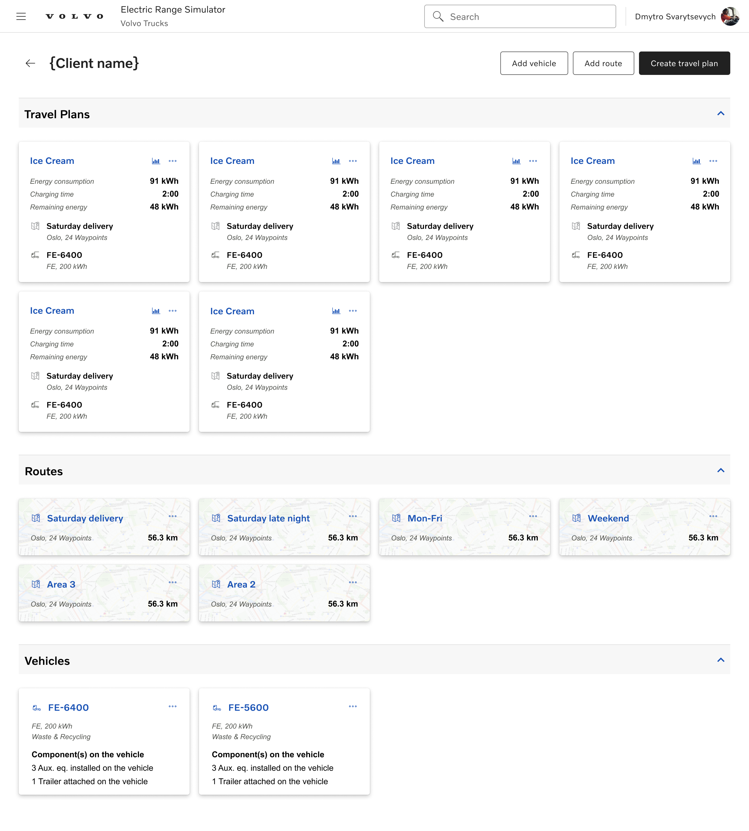
A client buys a few vehicle models, so those sit at the top. Details fill in progressively as the contract clarifies.

Routes stay lean, because one customer rarely needs many. Travel plans multiply as dealers hunt for the most efficient setup, so the page gives them a quick comparison view carrying the parameters that decide.

Final design of the Customer Profile page, with prominent vehicle model cards at the top, a contract details section, and a travel-plan comparison block below.
Page 02 · Route management

Reusable routes, independent of simulations.

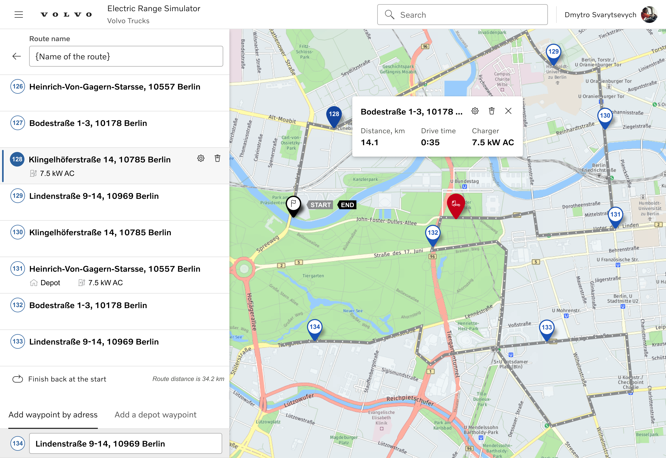
Route management is waypoints and their parameters, nothing else. A route lives outside any single simulation, so a dealer builds it once and reuses it across every scenario they run for the customer.

Final design of the Route Management page, with a waypoint list on the left and an interactive route map on the right.
Page 03 · Travel plan

A spreadsheet with real-time feedback.

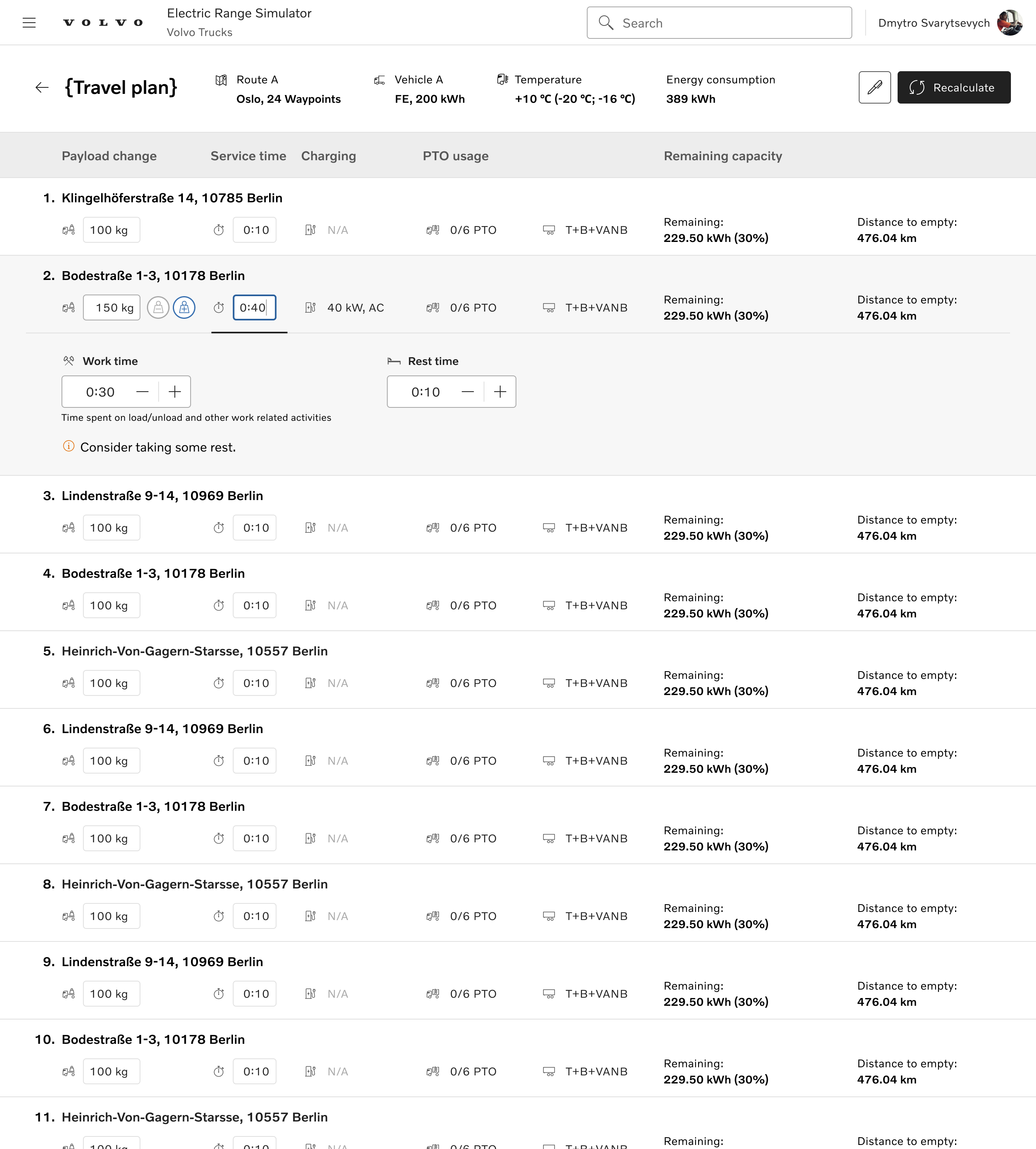
The travel plan brings route and vehicle together. Per-waypoint activities like loading, unloading, or a short recharge are edited inline, and the energy impact updates at the top as the plan changes.

The layout borrows from the spreadsheet dealers already trusted. Activities and battery capacity read at a glance; one click expands a waypoint when the detail matters.

Final design of the Travel Plan page, a spreadsheet-style table with per-waypoint rows, inline controls for activities, and a real-time energy summary row at the top.
Page 04 · Vehicle parameters

Choice-based inputs, minimal keyboard switches.

Fleet managers reuse consistent configurations, so speed and precision beat flexibility here. Most controls are choice-based: every option visible, no keyboard-mouse switching, less to hold in mind while configuring a truck.

Final design of the Vehicle Parameters page, organized as choice-based selectors and option chips rather than free-form inputs, reducing keyboard-mouse switches for fleet managers.
Takeaways

Dealers came back when the tool matched how they sell. Setup dropped from 40 minutes to 10. In user tests, the average satisfaction rating rose 45% compared with the original workflow. One lesson stayed with me: when adoption is low, study the workaround. The dealers' Excel files already showed what the tool should be.