A first visit needs
a starting point.
The founders brought me in to review the UI and interactions. The product was already in use. My audit raised a question: how would someone plan a first visit through these separate tools?
User conversations clarified that starting point. The traveller needed ideas for what to see and a sense of how much would fit. I used that need to connect discovery with a plan taking shape.

The trip became the main view.
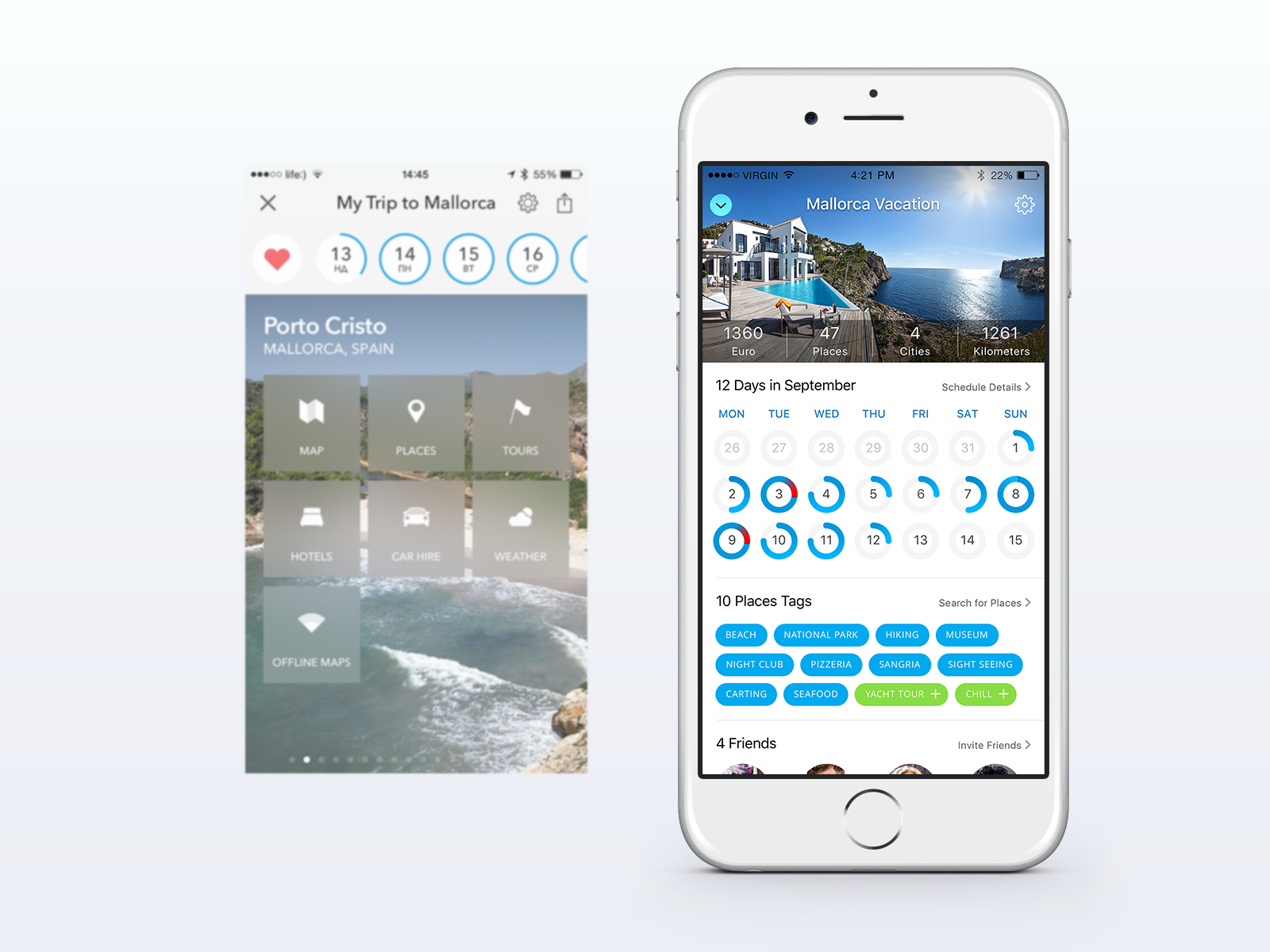
I brought the schedule, interests and companions into one scrollable overview. The plan had a home. Hotels and car hire stayed within reach, alongside the trip information they related to.
Judge a place before opening its details.
The original list showed names and descriptions. Practical context took another tap. I moved time, likes, price and distance onto each result row.
The next stop has to fit. Travellers can compare the time, cost and distance before adding it to the trip.

Help the traveller see
what fits into the plan.
Show when a day is too full.
Each day became a ring showing how full the plan was. A red segment warned of overload. I wanted travellers to catch an overloaded day before the trip.
Put new ideas beside the schedule.
Selected interests and suggested tags appeared in the trip overview. They connected discovery with planning. Search remained available for travellers who already knew what they wanted.
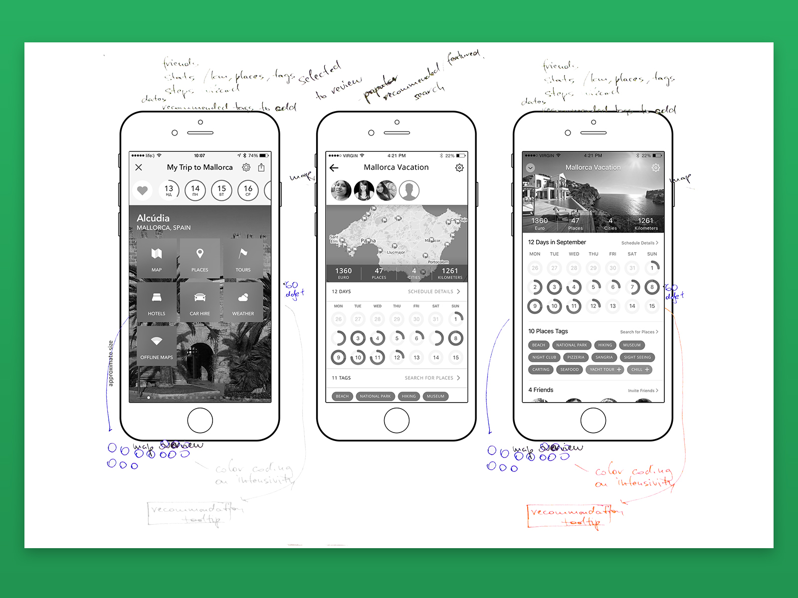
The team supported the proposal.
"Dmytro has presented us with a UX solution for Tripomatic mobile app that the whole team immediately liked. He has done an extremely good job in researching who our users are ... and suggested a smart and very well thought out navigation scheme that simplifies the overall experience."
I delivered the navigation proposal and interface designs. My engagement ended at handoff. The founder's feedback confirms the team's response to the work.
The subsequent rollout is unconfirmed. I don't have usage results to report. The before-and-after designs and working notes show the scope of the proposal.
Tripomatic was an early lesson in organising a product around what the user is trying to do. I returned to it in enterprise work. Here, the trip connected the schedule, places and bookings.