Wealth management app · Freelance · 2016

The moodboard voted in red and green.

An iOS app for a robo-advisory concept: curated investment baskets you can browse, follow, and buy into. Before any screen, I graded some forty reference apps in red and green ink. The green notes became the design principles, and every shipped screen can be traced back to one of them.

Product Designer·Research, IA, UI, engineering handoff
The research

Forty apps, graded in two colors.

Financial data on a four-inch screen was the whole problem: seven-figure portfolio values, allocation donuts, return charts, all legible at arm's length. I collected the best dashboard, finance, and travel UI of the era into one board and annotated it in two colors. Green for what earns adoption, red for what kills trust.

The point of the exercise is the wording. Each note is short enough to grade a screen against, and that's how they got used.

A collage of roughly forty app screenshots annotated in green and red handwriting: green notes like big numbers clear, charts show status, in-context controls; red notes like too many colors, not professional, overcrowded.
The critique board. Green ink adopts, red ink rejects. The screenshots underneath are the 2016 reference set: finance dashboards, weather cards, travel apps.

Green: adopt

  • Big numbers clear
  • Charts show status
  • One key KPI, then smaller
  • In-context controls
  • Chart as background
  • Icon on the left to simplify readability

Red: avoid

  • Too many colors
  • Not professional
  • Overcrowded
  • Text not readable
  • Dark background
  • Too much white, nothing to show
The structure

Two roles, one map.

The product is two-sided: investors follow and buy curated baskets, portfolio managers publish and run them. The IA is drawn as two swimlanes, and the screens both roles share are marked, so the build wouldn't duplicate what could be reused.

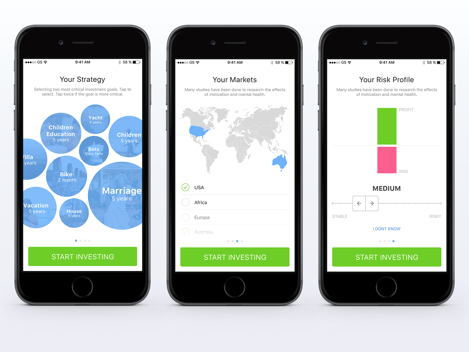
The investor's journey runs from a profiling survey through accounts and goals to the basket catalog, news, and the managers themselves. Onboarding is where the profiling happens, so it got designed as the product's first pleasant moment: goals as weighted photo bubbles, markets as a tappable world map, risk as a paired profit-and-risk stepper with an honest I-don't-know escape.

Information architecture map with two persona swimlanes, investor and portfolio manager, covering onboarding, profile, goals, accounts, basket catalog, news, friends, and notifications. Shared screens are highlighted.
The full screen map. Highlighted tiles are shared between the two roles.
The screens

Every screen answers to a green note.

The traceability is the craft story here: principle by principle, the critique became the interface.

Three iPhones showing the onboarding survey: investment goals as sized photo bubbles like marriage and children's education, a world map with markets to select, and a profit versus risk stepper set to medium with an I don't know link.
The profiling survey. Goal bubbles grow when tapped twice ("tap twice if the goal is more critical"), markets are a map instead of a dropdown, and the risk stepper keeps an I-don't-know way out.
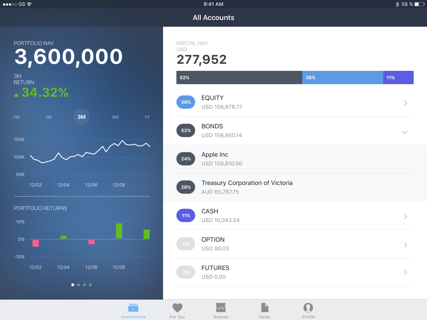
Two iPhones with the investments dashboard: a large portfolio NAV of 3.6 million with a return chart as the header background and a range switcher, and a donut allocation view splitting equity, bonds and cash with expandable holdings.
"Big numbers clear" became the NAV header; "chart as background" became the header itself; "in-context controls" became the range switcher living on the chart. Green and pink carry gains and losses, and nothing else.
Three iPhones with a curated basket's detail screens: assets tab with a holdings donut, news tab with activity from followed investors, and related baskets for comparison, each with an invest button pinned at the bottom.
A basket's detail across its tabs: holdings, news and activity from the investors following it, and related baskets to compare. The social layer carries the trust the numbers alone can't.
iPad in landscape showing a master-detail split: the dark portfolio panel with total value on the left, a basket's allocation bars and holdings list on the right.
The iPad adaptation: the phone's stacked story becomes a master-detail split. Same hierarchy, one more axis.
Handoff

Specced down to the letter-spacing.

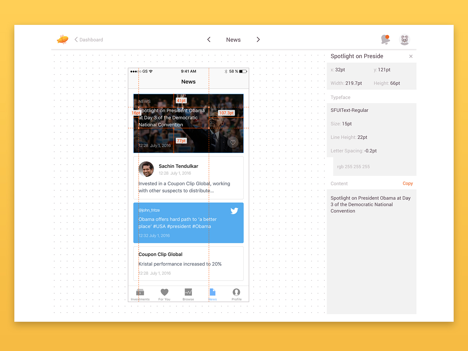
The mockups went to engineering through Zeplin with live redlines: positions, sizes, and type down to SF UI Text at 15 points, 22-point line height, minus 0.2 letter-spacing. In 2016 that pipeline was the difference between a portfolio picture and a buildable screen.

It's also why this case survives: the design was made to be inspected.

The news screen open in Zeplin with redlines: element coordinates and sizes in points, and a type spec of SF UI Text regular 15 points with 22 point line height.
The news screen in Zeplin. Coordinates in points, copyable content, exact type specs.
Takeaways

This is the oldest consumer work on this site, and its screens read as 2016. The habit it started still runs everything I ship: write the principles down before the screens, in words short enough to grade a screen against. "Big numbers clear" survived a decade better than any of the pixels.