Reading cost data
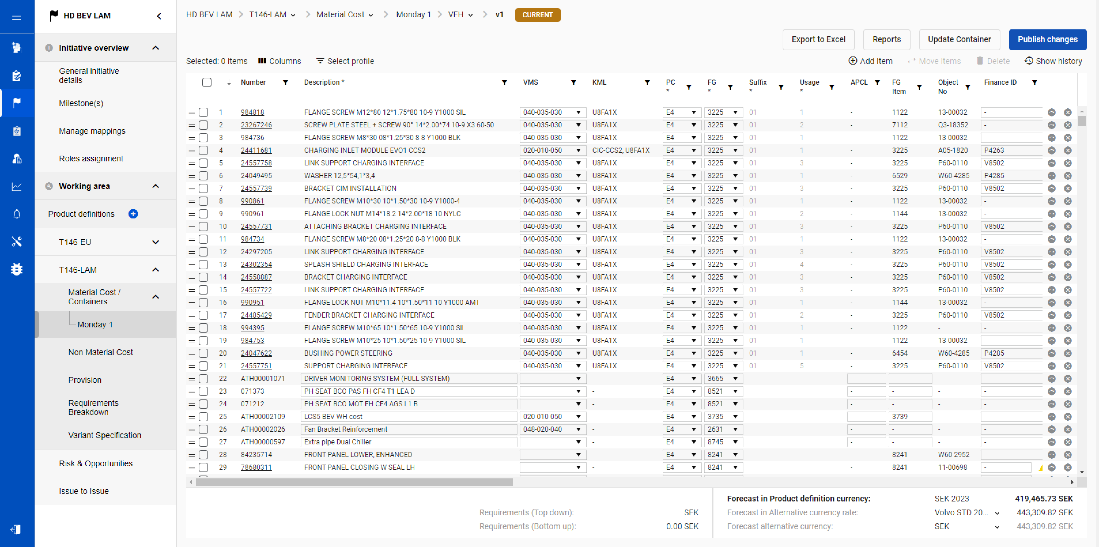
FindingTables followed a print layout, with tight rows and little interactive support. Dense figures competed for attention.
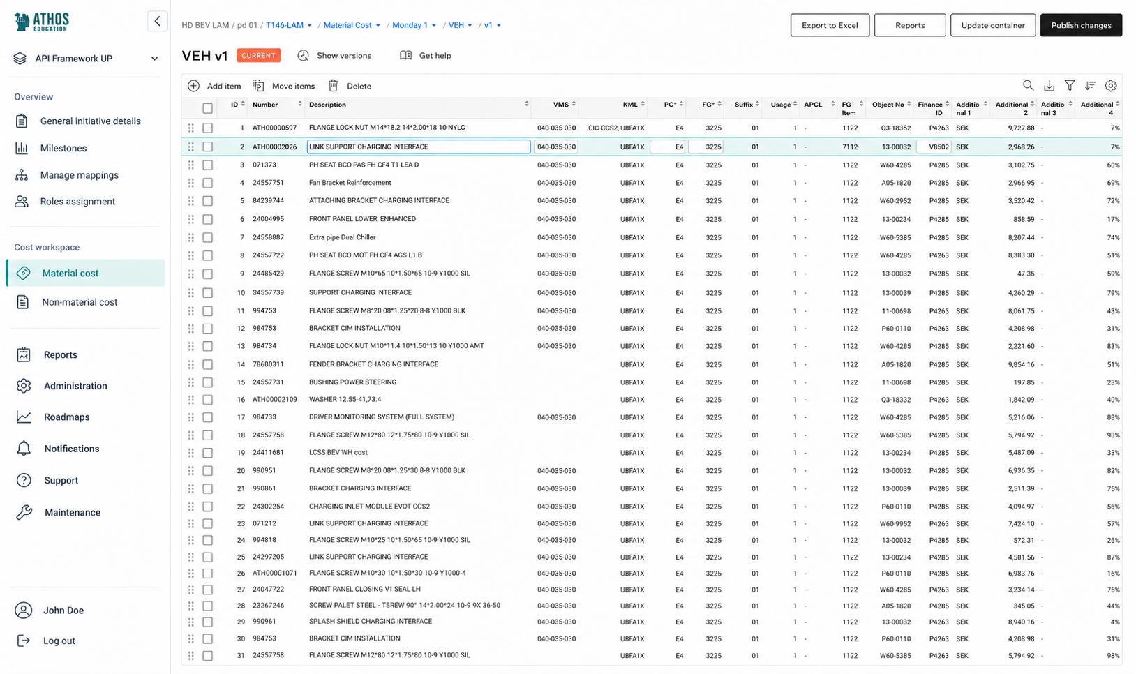
ProposalUse familiar Office 365 table patterns. Give data more room and keep edits close to their values.
Finance engineers at Volvo Group use Athos to set cost targets, track material and non-material costs, and update forecasts for new products. I audited the workspace and turned the findings into table patterns and a phased redesign. The cost detail had to stay.
Context
Finance project managers and product finance engineers use Athos to manage costs for new vehicles. The work spans material and non-material costs, targets and forecasts. Each figure belongs to a product and a responsible person. That context matters as much as the number.
A small update in 2023 had left the larger layout problems in place. I reviewed how the interface supported cost work and designed the changes for the next iteration. This was a mandatory tool. Finance engineers needed to keep using it throughout the transition.
Audit
I reviewed the cost tables, page layouts and navigation against the work of finance project managers and product finance engineers. The surrounding tools mattered. Office 365 and Azure showed patterns users already knew; the Volvo Experience System gave me a reference for shared components, typography and colour.
I gathered the existing controls before proposing changes. The patterns repeated across pages. Missing titles, shifting actions and a wide sidebar made the same cost work harder to follow in different places. I grouped the findings by the part of the workspace they affected and connected each to a design change.
FindingTables followed a print layout, with tight rows and little interactive support. Dense figures competed for attention.
ProposalUse familiar Office 365 table patterns. Give data more room and keep edits close to their values.
FindingSome pages lacked titles. Status, settings and wizard steps appeared in inconsistent places.
ProposalGive each page a consistent header and hierarchy. Keep the product, version and current task in view.
FindingSimilar buttons moved between pages. Page actions, view settings and record controls were mixed together.
ProposalGroup controls by what they affect. Place page, view and object actions consistently near their context.
FindingA two-column sidebar consumed table space. The active page was hard to identify.
ProposalUse one navigation column and a visible active state. Return the recovered width to the cost table.
FindingDecorative blue competed with action colours. Fonts and alerts departed from Volvo's design language.
ProposalApply the Volvo palette and shared components by role. Reserve visual emphasis for actions and meaningful states.
Condensed from my 2024 audit and proposal. These are expert-review findings; I did not measure their effect on task time or error rates.
Workspace
The table needed its own treatment. I proposed VES components for the shared interface, with a separate table pattern suited to dense cost work. Inline fields stay in the row they edit, while the layout keeps product and version context visible above the data.
The action groups make the distinction concrete. Export and publish belong to the page; filters and grouping belong to the view. Add, move and delete sit together above the records. This gives the team a pattern to apply across the cost platform.
Delivery
I shared the proposal in individual conversations before the wider presentation. The product owner was my main partner. Engineers could identify backend constraints, the scrum master could support the team process, and business representatives and key users could help the work compete with new features.
I asked what people thought and what next steps they would recommend. Their language mattered. I listened to the arguments they used and reused those terms when explaining the changes. The proposal split the work into stages, starting with the table used for reading and editing costs.
Improve the surface where cost engineers work with the data.
Adopt Volvo's design system and a consistent page layout.
Move to one column with a visible active location.
Put view and record actions in consistent places.
Outcome
The work moved from audit and proposal through QA into production. I designed the layouts and table patterns; the team implemented the changes. I have no post-release usage metrics. The cost data and editing tasks remained central.
The cost detail had to stay. A forecast needs its product and version in view. My contribution was to make that context easier to follow, and to give edits and actions consistent places in a dense financial workspace.
Practice
I developed a review checklist using Nielsen's heuristics, organized around the usability outcomes in ISO 9241-11: effectiveness, efficiency and satisfaction. The questions make the review explicit. Each entry has a weight, an assessment and room for observations, so the reasoning stays available after the review.
I also implemented a visual review rubric in my AI team operating system. The scope is broad. It connects product goals and user tasks with the quality of the interface and its implementation. This is my wider toolkit today; the Athos findings above come from the original audit.
People, goals & context
Checklist questions based on Nielsen's heuristics
My SDLC rubric
In SDLC, I made the review return specific deficiencies, ordered by criticality, with a proposed fix for each. Each pass records what it examined. After corrections, the system runs the review again and reports what remains; anything it could not inspect stays explicit. Craft still needs my judgment.
Other projects needed different evidence. In fleet planning, I used an audit to open a conversation with users and checked feature assumptions against usage data. In Neptune, a feature audit with frontend engineers exposed the overlap between reports and dashboards.
At SoftServe, I made reviews routine. Small critiques, milestone reviews and pre-release bug bashes gave designers and engineers different ways to catch problems. In the holiday-planning project, an interface review uncovered a larger question about the product's audience and value proposition.
AI products add another set of questions. My SDLC usability rubric checks whether people can stop or undo an AI action, correct its output and understand its limits. It also examines how much initiative the system takes and what happens when the AI cannot complete the task.